
Welcome to today’s blog.
Today I will be showing how to make your Angular application more responsive with some common UI forms.
In the previous post I showed how to make Angular forms mobile responsive.
I will introduce the CSS3 method that you may or may not have used before to style your forms to make them responsive. If you have not used CSS3 then refer to the previous post for how it would be used within Angular forms.
I will show how to use CSS grids in Angular UI forms and explain how the various styling properties are used.
Normally, we use CSS to style our forms by providing additional color, font styling, sizing our fonts and headers, styling our HTML elements such as DIVs and HTML control elements such as checkboxes and lists. We might also re-style our Material or Bootstrap themed elements.
The resizing of CSS DIVs to accommodate different device dimensions is something we can achieve using a combination of application state, logic, and CSS media queries. While this is quite successful in achieving the end presentation goal, it leads to increased maintenance and technical debt in the UI.
By using CSS grids, we can make UI forms that use grids more maintainable and easier to implement, so there is less of a maintenance burden later.
In today’s blog I will show how we can improve the responsiveness of a basic login form.
Converting a Basic Dashboard to Using Responsive CSS Grid
With a dashboard, I have a basic HTML script which uses an Angular Material Card with div elements.
The original HTML (with the detailed HTML script of each report omitted) is shown below:
<div id="heading" class="heading"><b>Dashboard</b></div>

<div class="flex-container">

    <div class="flex-item-left">
        <mat-card style="border-style: outset;">
            <mat-card-title>
                <div id="heading" class="heading"><b>Top 5 Books</b></div>
            </mat-card-title>

            <mat-card-content>
      		    . . .
            </mat-card-content>
        </mat-card>
    </div>

    <div class="flex-item-right">
        <mat-card style="border-style: outset;">
            <mat-card-title>
                <div id="heading" class="heading">
                    <b>Most Outstanding Loans</b>
                </div>
            </mat-card-title>

            <mat-card-content>
		        . . .
            </mat-card-content>
        </mat-card>
    </div>
</div>

<div class="flex-container">
    <div class="flex-item-left">
        <mat-card style="border-style: outset;">
            <mat-card-title>
                <div id="heading" class="heading">
                    <b>Most Overdue Loans</b>
                </div>
            </mat-card-title>

            <mat-card-content>
		        . . .
            </mat-card-content>
        </mat-card>
    </div>
</div>
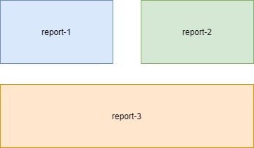
With the CSS grids I will move the above HTML sub-reports into a CSS grid layout. The proposed new layout is shown below:
When we define a CSS grid, it needs to be within a container DIV, we will call the container div wrapper. In addition, the display attribute needs to be set to grid.
display: grid;
We can set the rows heights and column widths using either percentages, pixels, fractions or CSS functions such as minmax(), max-content() or min-content() to control the sizing of our rows and columns depending on the size of the web page.
With fractions, before the column or row that is fractionalized, any concrete sizes are applied to the other rows and columns before fractions are applied.
We set the grid template rows as shown with two reports in the first row, with the third report siting on the second row:
grid-template-rows: 1fr 1fr;
grid-template-columns: 1fr 1fr;
The template areas have the first two reports spanning one column each, with the footer areas that spans one grid column and a footer that spanning all grid columns.
Unlike the login form CSS grid that we saw in the previous post, here we do not have any content area slots that are designated empty.
With content that is rendered spanning across multiple grid columns we repeat the content area. In this case. We repeated the last report two times to span the entire columns of our template areas:
grid-template-areas:
"report1 report2"
"report3 report3";
The CSS is shown below:
.wrapper
{
    display: grid;
    grid-row-gap: 2em;
    grid-template-rows: 1fr 1fr;
    grid-template-columns: 1fr 1fr;
    grid-template-areas:
    "report1 report2"
    "report3 report3";
}

.report1-area {
    grid-area: report1;
}

.report2-area {
    grid-area: report2;
}

.report3-area {
    grid-area: report3;
}
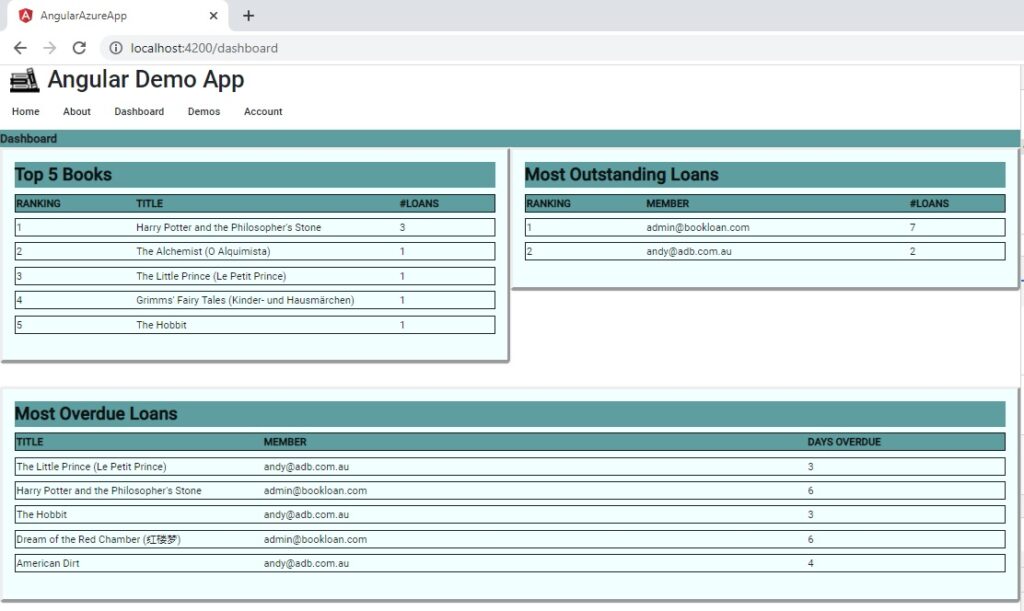
When the run the application, the dashboard shows as expected:
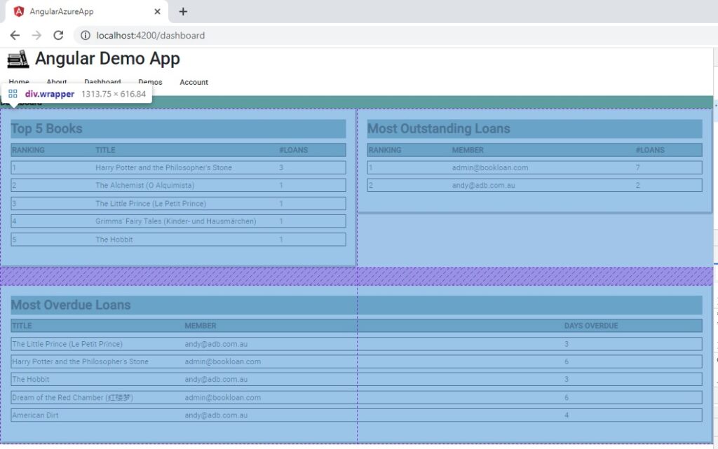
To inspect the CSS grid row and column lines, we can use the browser inspector:
In the next section we will amend the CSS to make the dashboard responsive for additional screen sizes.
Making the Dashboard Responsive
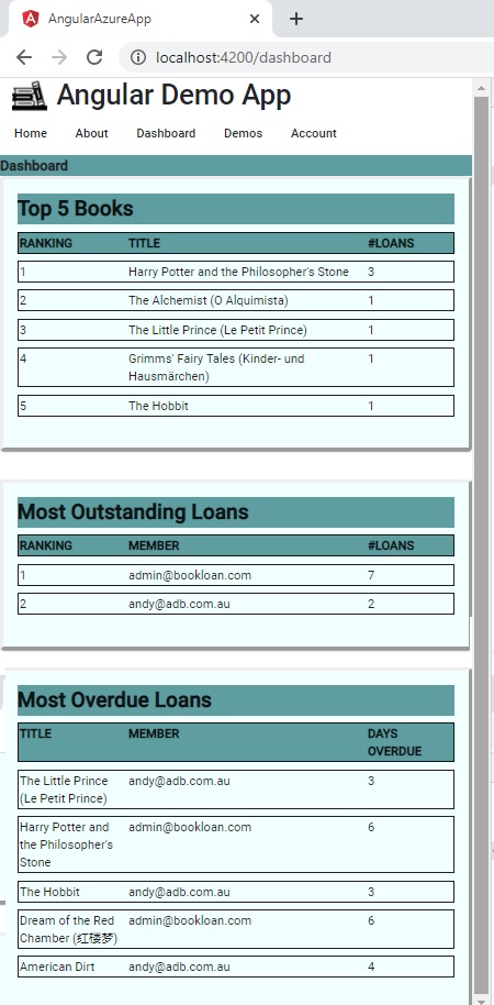
Next, to make our dashboard respond to a mobile device size, we use CSS queries to wrap the second report and resize the third report to fit the width in a mobile display.
I use 360px and 576px breakpoints for mobile and medium-sized displays.
@media all and (min-width: 360px) {
    .wrapper
    {
        display: grid;
        grid-row-gap: 2em;
        grid-template-rows: 1fr;
        grid-template-columns: 1fr;
        grid-template-areas:
        "report1"
        "report2"
        "report3";
    }
}

@media all and (min-width: 576px) {
    .wrapper
    {
        display: grid;
        grid-row-gap: 2em;
        grid-template-rows: 1fr 1fr;
        grid-template-columns: 1fr 1fr;
        grid-template-areas:
        "report1 report2"
        "report3 report3";
    }
}

.report1-area {
    grid-area: report1;
}

.report2-area {
    grid-area: report2;
}

.report3-area {
    grid-area: report3;
}
When the application is run and resized to a mobile-sized width the display adapts accordingly:
The final HTML is shown below:
<div id="heading" class="heading"><b>Dashboard</b></div>

<div class="wrapper">

  <div class="report1-area">
    <mat-card style="border-style: outset;">
      <mat-card-title>
        <div id="heading" class="heading"><b>Top 5 Books</b></div>
      </mat-card-title>

      <mat-card-content >
      		. . .
</mat-card-content>
    </mat-card>
  </div>

  <div class="report2-area">
    <mat-card style="border-style: outset;">
      </mat-card-content>
		. . .
    </mat-card>
  </div>

  <div class="report3-area">
    <mat-card style="border-style: outset;">
	. . .
    </mat-card>
  </div>

</div>
As we can see, the HTML and CSS looks uncomplicated and easy to maintain. We didn’t have to use any logic in the HTML or script to resize the content based on screen dimensions. We just used the CSS3 grid and media queries to do that for us.
As an additional challenge with dashboards, you can also try experimenting with charts, and reports that dynamically vary in height.
That’s all for today’s post.
I hope you fond this post useful and informative.
Andrew Halil is a blogger, author and software developer with expertise of many areas in the information technology industry including full-stack web and native cloud based development, test driven development and Devops.

