
Welcome to today’s blog.
Today I will be showing how to make your Angular application more responsive with some common user interface forms.
When you create an Angular application from the default CSS stylesheets, the application is by default not responsive. By scripting additional CSS stylesheet rules, we can improve the look and feel of the application. However, this does not necessarily improve the responsiveness of the application when it is rendered in different devices, such as mobiles, tablets, and resized web screens.
When the application is resized or is displayed in differing device dimensions, the screen elements should adjust their positioning according to the amount of screen real estate this is available. This might involve wrapping to the next row or even changing the dimensions of the elements themselves.
Using CSS3 for Responsive Styling
I will introduce the CSS3 technique that you may or may not have used before to style your forms for use responsively.
I will show how to use CSS grids in Angular UI forms and explain why I am using various properties.
Normally, we use CSS to style our forms by providing additional color, font styling, sizing our fonts and headers, styling our HTML elements such as DIVs and HTML control elements such as checkboxes and lists. We might also re-style our Material or Bootstrap themed elements.
The resizing of CSS DIVs to accommodate different device dimensions is something we can achieve using a combination of application state, logic, and CSS media queries. While this is quite successful is achieving the end presentation goal, it leads to increased maintenance and technical debt in the UI.
By using CSS grids, we can make UI forms that use grids more maintainable and easier to implement, so there is less of a maintenance burden later.
In the next section I will show how we can improve the responsiveness of a basic login form.
Converting a Basic Login Form to using Responsive CSS Grids
With a login form, I have a basic HTML script which uses an Angular Material Card with Material form fields.
There is a login, password, and submission button. The original HTML is shown below:
<mat-card>
    <mat-card-content>
        <div id="heading"><b>{{heading}}</b></div>

        <form [formGroup]="form"
            (ngSubmit)="login(form.controls.email.value, form.controls.password.value)">
            <mat-form-field>
                <input matInput id="email" type="email"
                       placeholder="Email" formControlName="email">
            </mat-form-field>
            <mat-form-field>
                <input matInput id="pwd" type="password"
                       placeholder="Password" formControlName="password">
            </mat-form-field>
            <button mat-raised-button id="btnLogin"
                    color="primary" [disabled]="!form.valid">
                    Login
            </button>
        </form>
    </mat-card-content>
</mat-card>
With the CSS grids I will move the above HTML login form into a CSS grid layout. The proposed new layout is shown below:

When we define a CSS grid, it needs to be within a container DIV, we will call the container div wrapper. In addition, the display attribute needs to be set to grid.
display: grid;
We can set the rows heights and column widths using either percentages, pixels, fractions or CSS functions such as minmax(), max-content() or min-content() to control the sizing of our rows and columns depending on the size of the web page.
With fractions, before the column or row that is fractionalized, any concrete sizes are applied to the other rows and columns before fractions are applied.
We set the grid template rows as shown with a fixed header and sign-in, but make the footer flexible:
grid-template-rows: 50px 150px 1fr;
We set the grid template columns as shown with a fixed sign-in, but make the sides flexible:
grid-template-columns: 1fr 300px 1fr;
The template areas have a header and sign-in areas that spans one grid column and a footer that spans all grid columns.
With content area that is not rendered on a particular grid column we use a period “.” to indicate that slot is empty.
With content that is rendered spanning across multiple grid columns we repeat the content area. In this case. We repeat the footer area three times to span the entire three columns of our template areas:
grid-template-areas:
header ."
". signin ."
"footer footer footer";
The CSS is shown below:
.wrapper
{
    display: grid;
    grid-row-gap: 2em;
    grid-template-rows: 150px 150px 1fr;
    grid-template-columns: 1fr 300px 1fr;
    grid-template-areas:
    ". header ."
    ". signin ."
    "footer footer footer";
}

.header-area {
    grid-area: header;
}

.form-heading {
    font-weight: bolder;
    font-size: xx-large;
}

.signin-area {
    grid-area: signin;
}

.footer-area {
    grid-area: footer;
    text-align: center;
    position: absolute;
    bottom: 0;
    left: 0;
    right: 0;
}
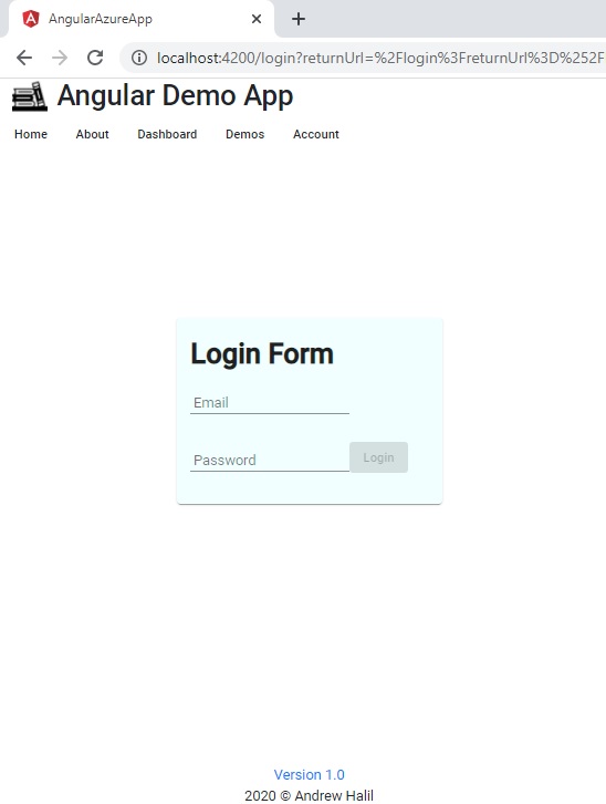
When the run the application the login form moves into the centre of the screen:
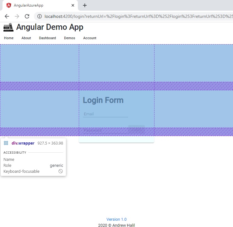
To inspect the CSS grid row and column lines, we can use the browser inspector:
Note that the footer is not showing near the sign-in area as we have re-positioned the content absolute to the display with no offset from the bottom.
Making the Form Responsive with Media Queries
Next, to make our form respond to a mobile device size, we use CSS queries to reduce the sign-in area height in a mobile display.
I use 360px and 576px breakpoints for mobile and min-sized displays.
@media all and (min-width: 360px) {
    .wrapper
    {
        display: grid;
        grid-row-gap: 2em;
        grid-template-rows: 50px 150px 1fr;
        grid-template-columns: 1fr 300px 1fr;
        grid-template-areas:
        ". header ."
        ". signin ."
        "footer footer footer";
    }
}

@media all and (min-width: 576px) {
    .wrapper
    {
        display: grid;
        grid-row-gap: 2em;
        grid-template-rows: 150px 150px 1fr;
        grid-template-columns: 1fr 300px 1fr;
        grid-template-areas:
        ". header ."
        ". signin ."
        "footer footer footer";
    }
}
We can also reduce the font size of the sign-in header as shown:
@media all and (min-width: 360px) {
    div.form-heading {
        font-size: small;
    }
}

@media all and (min-width: 576px) {
    div.form-heading {
        font-size: xx-large;
    }
}
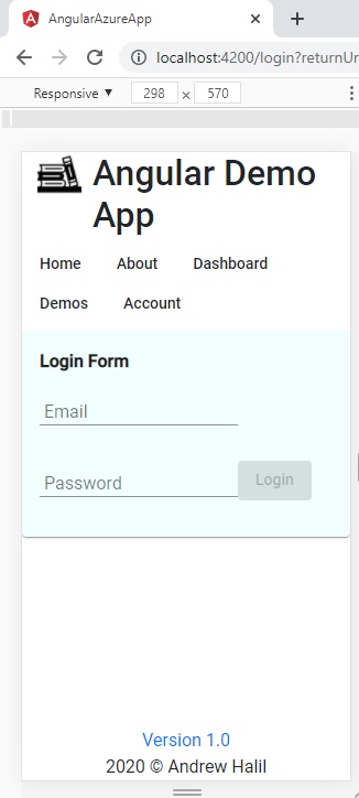
When the application is run and resized to a mobile-sized width the display adapts accordingly:
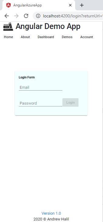
When the display is widened the font boldens and increases in size.
When we choose a mobile responsive display, the form renders as shown:
The final HTML is shown below:
<div class="wrapper">
<div class="header-area"></div>
<div class="signin-area">
<mat-card>
<form [formGroup]="form"
(ngSubmit)=
"login(form.controls.email.value, form.controls.password.value)">
<div class="form-heading" id="heading">
<b>{{heading}}</b>
</div>
<div>
<mat-form-field>
<input matInput id="email" type="email"
placeholder="Email" formControlName="email">
</mat-form-field>
<mat-form-field>
<input matInput id="pwd" type="password"
placeholder="Password" formControlName="password">
</mat-form-field>
<button mat-raised-button id="btnLogin"
color="primary" [disabled]="!form.valid">
Login
</button>
</div>
</form>
</mat-card>
</div>
<div class="footer-area">
<a href="#">
<span>Version 1.0</span>
</a>
<br />
<span class="footer-text">2020 © Andrew Halil</span>
</div>
</div>
As we can see, the HTML and CSS looks uncomplicated and easy to maintain. We didn’t have to use any logic in the HTML or script to resize the content based on screen dimensions. We just used the CSS3 grid and media queries to do that for us.
That’s all for today’s post.
I hope you fond this post useful and informative.
Andrew Halil is a blogger, author and software developer with expertise of many areas in the information technology industry including full-stack web and native cloud based development, test driven development and Devops.

