
Welcome to today’s post.
In today’s post I will be showing you how to implement a useful progress indicator that will be incorporated within a busy process within a .NET Core Blazor Server web application.
In the previous post, I showed how to display a modal dialog that contained input parameters to a process that was run after the user confirmed the dialog. In this post, I will be improving the running of the process with a visual progress indicator.
I will start off by explaining what progress indicators are, why we use then in an application. I will then show ways of implementing them and choosing a starter CSS stylesheet. I will then show how to add and conditionally display CSS progress loaders within a Blazor application dialog.
What are Progress Indicators and why use them within an application?
I will first define what progress indicators are. Then more generally, I will then give the reasons for using progress indicators within applications and when to use them within applications. I will then provide an overview of two different ways in which we can implement a progress indicator within the application.
Progress indicators, also known as progress loaders, or progress spinners (not to be confused with the numeric input controls that are known as spinner controls with the up and down arrowed buttons to increase or decrease integer values) are a user interface control used to provide users with visual feedback on the progress of a long running uninterruptible process.
What are the justifications for using visual indicators within an application?
Some of the reasons for using visual indicators are:
- Provide instant feedback on a longer running application process.
- Make lengthy application processes seem more responsive.
- Reduce unresponsiveness in some application processes.
- Reduce frustration from users when certain application processes are running.
One reason for not including a progress indicator would be when a process is run asynchronously: there is no need to use progress indicators as the actual task or thread that is running the process is external to the main application thread. When an application process is run in a separate process or in a separate thread, the user is not required to wait for the completion of the task as the CPU and memory resources are delegated either to a separate thread of process.
However, if the process completion itself is a dependency of another part of the application, such as a subsequent step in a wizard or required for commencement of another application feature, then a progress loader may still be required. Where an asynchronously run task completes, a replacement for a progress loader can include a notification email, or even a notification icon displayed in the application status bar or menu bar.
Some application contexts where a progress indicator would be utilized are:
- During application startup.
- Reports rendering.
- Execution of data centric operations, such as queries or CRUD operations.
- Calling external web services or APIs.
In the next section, I will show some ways in which we can display these progress indicators.
Ways of Implementing Progress Indicators
Use pure CSS
With the first method we use CSS stylesheet to define the loader with a geometric shape, such as a circle that which has a color scheme, that is spun at a specific speed in a direction (clockwise or counter-clockwise).
Examples of CSS progress indicators are here:
Single color circular indicator

Single alternating color circular indicator

Multi-colored circular indicator

Use Animated GIFs
With this method we use a combination of an animated GIF, which is loaded in from a folder within our web site, and a CSS stylesheet that defines the file location, positioning, dimension, relative offset and overlay ordering of the loaded animated GIF.
An example of an animated GIF indicator is the well-known progress spinner:

The above CSS loaders are all circular, and of course, the stylesheet we choose will need to be compatible with the dimensions and shape of the loader, whether it is displayed as an animated icon or as animated CSS style. If we were to use a rectangular progress indicator, then the CSS style sheets would need to be changed to accommodate these.
In the next section, I will show an example CSS progress indicator script that we can use within our style sheet as a starting point for a basic CSS loader.
Stylesheet for CSS Progress Indicators
The stylesheets for progress indicators go into a style.css file that is located within the
\wwwroot\css
Subfolder within a Blazor Server project. Part of the CSS script here is adapted from the w3schools site’s article How to Make a Loader.
Below is the CSS for a single colour circular indicator:
#loader {
    position: absolute;
    left: 50%;
    top: 50%;
    z-index: 2000;
    width: 120px;
    height: 120px;
    margin: -76px 0 0 -76px;
    border: 16px solid #f3f3f3;
    border-radius: 50%;
    border-top: 16px solid #3498db;
    -webkit-animation: spin 2s linear infinite;
    animation: spin 2s linear infinite;
}

@-webkit-keyframes spin {
    0% {
        -webkit-transform: rotate(0deg);
    }

    100% {
        -webkit-transform: rotate(360deg);
    }
}

@keyframes spin {
    0% {
        transform: rotate(0deg);
    }

    100% {
        transform: rotate(360deg);
    }
}
In the next section will show how to add a CSS loader into a Blazor web form and conditionally display the loader within the Razor code within a Blazor web form.
Conditionally Displaying the CSS Loader into a Blazor Web Form
Adding the CSS loader into a Razor page is simple. All you do is add it in as a DIV element as shown:
<div id="loader"></div>
That is not the end of the implementation! We still need to conditionally display the div according to the state of the progress of a running process.
In the previous post I showed how to implement a modal dialog, which when confirmed by the user, ran a loan service that loaned the book on the specified input date.
What I will do is conditionally display the div element containing progress indicator while the process is executing. When the process ends, we will hide the div element.
I will show the dialog state class which we had in the previous post. It now contains an additional boolean property, LoanProgress, which allows us to track when the loan service call has started and when it has completed:
using BookLoanBlazorServerApp.Models;
using Microsoft.EntityFrameworkCore.ValueGeneration.Internal;

namespace BookLoanBlazorServerApp.Services;

public class BorrowState
{
    public bool ShowingConfigureDialog => Loan is not null;

    public LoanViewModel? Loan { get; set; }

    public bool LoanProgress { get; set; }

    public BorrowState()
    {
        this.LoanProgress = false;
    }

    public void ShowConfigureLoanDialog(BookViewModel book)
    {
        this.LoanProgress = false;

        Loan = new()
        {
            BookID = book.ID,
            DateCreated = DateTime.Today,
            DateLoaned = DateTime.Today,
            DateDue = DateTime.Today.AddDays(14),
            LoanedBy = "andyh",
            Book = book
        };
    }
}
Given the above additional property, we can now include the conditional logic to show or hide the progress indicator as shown:
@if (BorrowState.ShowingConfigureDialog && BorrowState.LoanProgress)
{
    <div id="loader"></div>
}
Below is some of the Razor markup with most omitted for brevity:
@page "/viewbook"
@using Microsoft.AspNetCore.Components
@using BookLoanBlazorServerApp.Services
@using BookLoanBlazorServerApp.Models
@inject IBookService LibraryBookService
@inject ILoanService LibraryLoanService
@inject BorrowState BorrowState
@inject NavigationManager PageNavigation

<PageTitle>View Book</PageTitle>

<h3>View Book</h3>

@if (book == null)
{
    <p><em>Loading...</em></p>
}
else
{
    <div class="form-field">
        <label>ID:</label>
        <span>
            @book.ID
        </span>
    </div>

    <div class="form-field">
        <label>Title:</label>
        <span>
            @book!.Title
        </span>
    </div>
    …
    …

    <br />

    <button class="btn btn-primary"
        @onclick="@(() => BorrowState.ShowConfigureLoanDialog(book))">
        Borrow
    </button>

    <br />

    @if (BorrowState.ShowingConfigureDialog && (BorrowState.Loan != null))
    {
        <ConfigureLoanDialog Loan="BorrowState.Loan"
                 OnCancel="CancelLoan"
                 OnConfirm="ConfirmLoan" />
    }

    @if (BorrowState.ShowingConfigureDialog && BorrowState.LoanProgress)
    {
        <div id="loader"></div>
    }
    <br />

    @if (Message.Length > 0)
    {
        <p>@Message</p>
    }

    <br />
}

<br />
With the Razor markup, we can display the current forms HTML element fields, along with the modal dialog and as we will see, the progress indicator.
For the progress indicator to display over the dialog in our form, we will have to modify the event handlers within our C# code segment to set the loan service call progress at the critical moments before and after the process completes and force a re-rendering of the Razor page at these critical points.
You can see how this pattern is within the partial code below for the ConfirmLoan() event handler :
// Execute loan for book.
private async void ConfirmLoan()
{
        if (this.BorrowState.Loan == null)
        {
            this.Message = "Loan service is still running. Wait for completion!";
            this.StateHasChanged();
            return;
        }

        this.BorrowState.LoanProgress = true;
        this.StateHasChanged();

        // conditional to check loan status
        {
            // code here that does the loan service calls
            …
            // end code

            this.Message = "Book has been successfully loaned for the chosen date.";
        }
        else
        {
            this.Message = "Book is not available for the chosen date.";
        }

        this.BorrowState.Loan = null;

        this.BorrowState.LoanProgress = false;
        this.StateHasChanged();
}
Essentially what I did here is add the following lines of code before the service call:
this.BorrowState.LoanProgress = true;
this.StateHasChanged();
With the first line setting the state for displaying the progress indicator, and the second line re-rendering the page to display the div containing the progress indicator.
Then I added the following lines of code after the service call:
this.BorrowState.LoanProgress = false;
this.StateHasChanged();
this.BorrowState.Loan = null;
With the first line setting the state for hiding the progress indicator, and the second line re-rendering the page to not display the div containing the progress indicator.
The final line setting the loan to null is used to close the dialog following the completion of the event.
Testing the Progress Loader within the Dialog
To test the progress indicator, we can simulate the running of the task by adding a delay of a few seconds:
System.Threading.Thread.Sleep(3000);
By adding the above delay into the ConfirmLoan() event handler, it allows us to view the progress. When testing is completed, we can remove it.
The placement of this line is shown below:
// Execute loan for book.
private async void ConfirmLoan()
{
    this.BorrowState.LoanProgress = true;
    this.StateHasChanged();

    BookStatusViewModel loan_status =
        await LibraryLoanService.GetBookLoanStatus(this.BorrowState.Loan!.Book.ID);
    if (loan_status.Status == "Available")
    {
        // code here that does the loan service calls
        …
        // end code

        System.Threading.Thread.Sleep(3000);

        this.Message = "Book has been successfully loaned for the chosen date.";
    }
    else
    {
        this.Message = "Book is not available for the chosen date.";
    }

    this.BorrowState.Loan = null;

    this.BorrowState.LoanProgress = false;
    this.StateHasChanged();
}
Below is the C# code for both the confirm and cancel event handlers provisioned to enable and disable the progress indicator:
@code {
    [Parameter]
    [SupplyParameterFromQuery]
    public int ID { get; set; }

    private BookViewModel book = new();

    protected override async Task OnInitializedAsync()
    {
        book = await LibraryBookService.GetBook(ID);
    }

    private string Message = String.Empty;

    // Execute loan for book.
    private async void ConfirmLoan()
    {
        this.BorrowState.LoanProgress = true;
        this.StateHasChanged();

        BookStatusViewModel loan_status =
            await LibraryLoanService.GetBookLoanStatus(this.BorrowState.Loan!.Book.ID);
        if (loan_status.Status == "Available")
        {
            await LibraryLoanService.SaveLoan(new LoanViewModel()
            {
                BookID = this.BorrowState.Loan!.Book.ID,
                DateDue = this.BorrowState.Loan!.DateLoaned,
                DateUpdated = DateTime.Now,
                OnShelf = false
            });

            this.Message = "Book has been successfully loaned for the chosen date.";
        }
        else
        {
            this.Message = "Book is not available for the chosen date.";
        }
        this.BorrowState.LoanProgress = false;
        this.BorrowState.Loan = null;
        this.StateHasChanged();
    }

    // Cancel loan
    private async void CancelLoan()
    {
        this.BorrowState.LoanProgress = false;
        this.Message = String.Empty;
        this.BorrowState.Loan = null;
        this.StateHasChanged();
    }
}
When the application is re-built and run, the initial state of the ViewBook screen shows the elements as labelled field and values, with a Borrow button:

Once clicked, the modal dialog pops up:
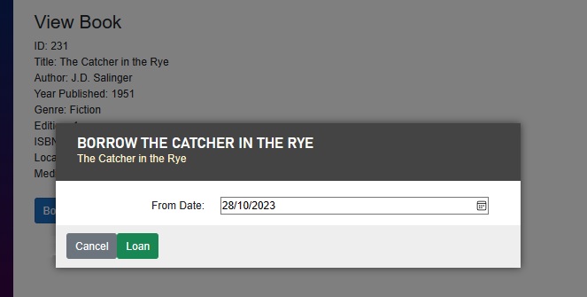
After selecting a new date or keeping the current date, we then click the Loan button to confirm the inputs.
We will then see the progress indicator display in front of the dialog as shown:

How did we manage to get the progress indicator to display in front of the dialog?
The reason is because we used a similar method to overlay the dialog in front of the existing form content.
Recall that in the dialog and dialog container CSS styles we used the following z-indexes:
.dialog {
    …
    z-index: 2000;
    …
}

.dialog-container {
    …
    z-index: 2000;
    …
}
To get our progress indicator to display over the dialog we will need to make the z-index higher than that for the dialog as shown:
#loader {
    …
    z-index: 3000;
    …
}
We have seen how to implement a CSS progress indicator within a .Net Core Blazor Server web application.
I will now show how to implement progress indicators with an animated GIF.
Stylesheet for Animated GIF Progress Indicators
As with the CSS loader, the stylesheets are in the same location, but there is the additional animated GIF image resource that will be placed within in the
\wwwroot
sub-folder within our Blazor Server project.
With our animated GIF files, where do we place them?
You can choose to create additional \image or \content sub-folders under the \wwwroot folder and reference them within our CSS stylesheet selector’s background-image property. When referencing a file name within the background-image property, the url() function file name parameter is relative to the \wwwroot\css sub-folder which contains all of our stylesheets:
background-image: url([file name.gif];
With an animated GIF progress loader CSS selector, we do not need to concern ourselves with geometric properties like borders, circular radii, spin speed, or animations. The loader will still need to be positioned absolutely from the top left corner of the page, horizontally and vertically centred.
As I mentioned, a relative file reference to a valid animated GIF resource will also need to be specified with the url() function of a background-image property.
In addition, we need to make it close to or exactly 100% opaque to make the image standout over the dialog.
One other thing to note, the width and height will need to be exact (or close to) the actual width an height of the animated GIF resource (which can be inspected within the file manager).
The CSS animated GIF loader will then be as shown:
#loader {
    position: absolute;
    background-image: url('../Spinning-Loader.gif');
    left: 50%;
    top: 50%;
    z-index: 2000;
    width: 120px;
    height: 120px;
    margin: -76px 0 0 -76px;
    opacity: 100%;
}
With the GIF file background image reference, if you specified an incorrect file name such as:
background-image: url('Spinning-Loader.gif');
Then a 404 (not found) error will show in the browser debugger console when the loader CSS style is loaded:

To finetune the CSS properties, you can extend the number of seconds the application is suspended in the ConfirmLoan() event handler for the System.Threading.Thread.Sleep(n) command, then inspect the CSS properties of the loader class within the DIV element within the browser developer pane and adjust the properties as you see fit and view the changes in the browser.
Below is an example from when we inspect the background_image property within the CSS loader and view the dimensions of the referenced animated GIF file:

When the application is run with the CSS change, the new CSS animated progress indicator will look as follows:

The above section has shown us how to implement a CSS progress indicator with an animated GIF within a .Net Core Blazor Server web application.
That is all for today’s post.
I hope you have found this post useful and informative.
Andrew Halil is a blogger, author and software developer with expertise of many areas in the information technology industry including full-stack web and native cloud based development, test driven development and Devops.