
Welcome to today’s post.
In today’s post I will be showing you how to implement custom dialogs in a .NET Core Blazor application.
I will also be explaining the reasons why you would use custom dialogs in web applications and how it can improve the usability of web applications.
In previous posts I showed how to create a .NET Core Blazor Server web application with Entity Framework Core. I also showed how to use implicit field validations and explicit field validations in a .NET Core Blazor data entry form. I will first go into the reasons for using custom dialogs in web applications.
Reasons for using Custom Dialogs in a Web Application
Dialogs provide different types of communication with users. They can provide user input that an application requires to retrieve information from a user to feed into a task of process. They can also be used to provide feedback to a user in the form of information, an error message, an option to retry or cancel an operation, or to accept or reject a response to question.
These dialogs can be modal, modeless, standardized, or customized.
I will explain each of the dialog types that are used in a web application.
Standard Modal Dialogs
We are all aware of the standard built-in dialogs that are built-in to a web application that uses JavaScript. These include the alert dialog box and the confirmation dialog boxes, that are both modal dialog boxes. With modal dialogs, the user must interact with the dialog and close it to allow the application interface thread to yield control to the system thread. Both the built-in alert and confirmation dialogs return responses, either Ok (for the alert), or Yes/No.
Custom Modal Dialogs
Custom modal dialogs are used to elicit custom data (or parameters) from the end user. This involves including input fields within the dialog body. After entering data into the input fields, the user then confirms or cancels the dialog with one of the Cancel or Confirm button in the footer of the dialog.
The response from the dialog if confirmed, results in a process being run based on the input parameters entered within the custom dialog. The process that is run can either be a service or report that depends on the entered input parameters. With the cancellation response, no process is executed.
With both dialog responses, the modal dialog box is automatically closed, and the user is returned either to the same form or to another destination form. There will also be a response from the interface that the confirmed action was either successfully or unsuccessfully executed. The response can take a few forms:
- A built-in or custom model alert dialog.
- A summary or message displayed on another page.
A prominent message displayed as a text in the same form with the result (possibly an error).
Custom Modal Dialogs and Usability
As I mentioned, with the custom modal dialogs, they are used to obtain input parameters from one form and send those inputs to a process which is either in the same form or in a separate process.
Depending on the number of input parameters that are being processed and the logical dependencies between the input parameters in a data entry form, the input parameters can be localized into one form or dialog for entry, or they can be distributed over multiple forms.
With a form that has many input fields, we can spread the data entry between tabbed forms or wizard step forms. An example of this could include data entry forms that have name, address, and contact details in their own sub-forms, which would consume too much real estate if they were in one single form or input dialog.
The provision of one custom modal dialog for inputs can give the user a more efficient means of passing inputs from a form to a process.
Integrating a Custom Dialog into a Razor Component
To incorporate a custom dialog into a Blazor Razor form parent component, requires the modal input dialog to be embedded into the markup of the parent component. This is done by creating the modal input dialog as its own component, then declaring the dialog within the markup of the parent Razor component.
The constituent components of a modal dialog are depicted in the following architectural diagram:

The components consist of:
- A parent Razor form component that presents some read-only details.
- An action button (that will trigger the dialog) on the parent Razor form.
- A child Razor dialog form component that contains the input fields.
- Code in the parent Razor form component that includes event handler methods for the dialog confirmation and cancellation actions.
- A state class that stores the dialog state.
- A process external to the above Razor components.
The first component is the dialog state. This is used to store a reference to the service and a flag that determines if the dialog is visible or not. This is shown below:
BorrowState.cs
using BookLoanBlazorServerApp.Models;
using Microsoft.EntityFrameworkCore.ValueGeneration.Internal;

namespace BookLoanBlazorServerApp.Services;

public class BorrowState
{
    public bool ShowingConfigureDialog => Loan is not null;

    public LoanViewModel? Loan { get; set; }

    public bool LoanConfirmed { get; set; }

    public BorrowState()
    {
        this.LoanProgress = false;
    }

    public void ShowConfigureLoanDialog(BookViewModel book)
    {
        this.LoanProgress = false;

        Loan = new()
        {
            BookID = book.ID,
            DateCreated = DateTime.Today,
            DateLoaned = DateTime.Today,
            DateDue = DateTime.Today.AddDays(14),
            LoanedBy = "andyh",
            Book = book
        };
    }

    public void CancelConfigureLoanDialog()
    {
        Loan = null;
    }

    public void ConfirmConfigureLoanDialog()
    {
        Loan = null;
    }
}
The next component is the parent component, which primarily contains read-only information for viewing a selected Book, and a button for actioning the borrowing of the current Book. It is shown below:
ViewBook.razor
@page "/viewbook"
@using Microsoft.AspNetCore.Components
@using BookLoanBlazorServerApp.Services
@using BookLoanBlazorServerApp.Models
@inject IBookService LibraryBookService
@inject ILoanService LibraryLoanService
@inject BorrowState BorrowState
@inject NavigationManager PageNavigation

<PageTitle>View Book</PageTitle>

<h3>View Book</h3>

@if (book == null)
{
    <p><em>Loading...</em></p>
}
else
{
    <div class="form-field">
        <label>ID:</label>
        <span>
            @book.ID
        </span>
    </div>

    <div class="form-field">
        <label>Title:</label>
        <span>
            @book!.Title
        </span>
    </div>

    <div class="form-field">
        <label>Author:</label>
        <span>
            @book.Author
        </span>
    </div>

    <div class="form-field">
        <label>Year Published:</label>
        <span>
            @book.YearPublished
        </span>
    </div>

    <div class="form-field">
        <label>Genre:</label>
        <span>
            @book.Genre
        </span>
    </div>

    <div class="form-field">
        <label>Edition:</label>
        <span>
            @book.Edition
        </span>
    </div>

    <div class="form-field">
        <label>ISBN:</label>
        <span>
            @book.ISBN
        </span>
    </div>

    <div class="form-field">
        <label>Location:</label>
        <span>
            @book.Location
        </span>
    </div>

    <div class="form-field">
        <label>Media Type:</label>
        <span>
            @book.MediaType
        </span>
    </div>

    <br />

    <button class="btn btn-primary"
        @onclick="@(() => BorrowState.ShowConfigureLoanDialog(book))">
        Borrow
    </button>

    <br />

    @if (BorrowState.ShowingConfigureDialog)
    {
        <ConfigureLoanDialog Loan="BorrowState.Loan"
                             OnCancel="CancelLoan"
                             OnConfirm="ConfirmLoan" />

    }

    <br />

    @if (Message.Length > 0)
    {
        <p>@Message</p>
    }

    <br />
}

<br />

@code {
    [Parameter]
    [SupplyParameterFromQuery]
    public int ID { get; set; }

    private BookViewModel book = new();

    protected override async Task OnInitializedAsync()
    {
        book = await LibraryBookService.GetBook(ID);
    }

    private string Message = String.Empty;

    // Execute loan for book.
    private async void ConfirmLoan()
    {
        BookStatusViewModel loan_status =
            await LibraryLoanService.GetBookLoanStatus(this.BorrowState.Loan!.Book.ID);
        if (loan_status.Status == "Available")
        {
            await LibraryLoanService.SaveLoan(new LoanViewModel()
            {
                BookID = this.BorrowState.Loan!.Book.ID,
                DateDue = this.BorrowState.Loan!.DateLoaned,
                DateUpdated = DateTime.Now,
                OnShelf = false
            });
            this.BorrowState.LoanConfirmed = true;
            this.Message = "Book has been successfully loaned for the chosen date.";
        }
        else
        {
            this.Message = "Book is not available for the chosen date.";
        }
        this.BorrowState.LoanProgress = false;
        this.BorrowState.Loan = null;
        this.StateHasChanged();
    }

    // Cancel loan
    private async void CancelLoan()
    {
        this.BorrowState.LoanConfirmed = false;
        this.Message = String.Empty;
        this.BorrowState.Loan = null;
        this.StateHasChanged();
    }
}
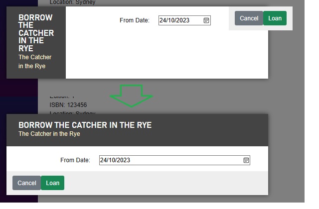
The rendering of the parent ViewBook Razor component with the Borrow action button is shown below:
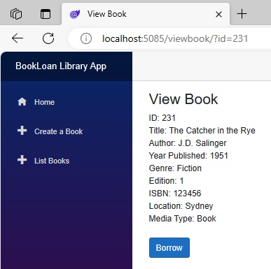
There are some important parts of the code that I will explain, and they have to do with how the dialog component visibility is controlled within the parent Razor component.
Controlling Custom Dialog Visibility
Before the dialog visibility can be ascertained, the dialog state needs to be initialised with the Book object and a Loan object created within the dialog state BorrowState class. This is done on the @onclick event for the Borrow button as shown, which calls the ShowConfigureLoanDialog() method to initialise the dialog state:
<button class="btn btn-primary"
        @onclick="@(() => BorrowState.ShowConfigureLoanDialog(book))">
        Borrow
</button>
The parent Razor component controls the visibility of the child dialog by checking the state of the ShowingConfigureDialog property of the BorrowState state class, which tests if the Loan object has been initialised. The markup that conditionally displays the dialog is shown below:
@if (BorrowState.ShowingConfigureDialog)
{
    <ConfigureLoanDialog Loan="BorrowState.Loan"
        OnCancel="CancelLoan"
        OnConfirm="ConfirmLoan" />
}
Before I explain how the dialog events operate, I will show the Razor dialog component, which is below:
ConfigureLoanDialog.razor
@using BookLoanBlazorServerApp.Models

@if (Loan == null)
{
    <p><em>Loading...</em></p>
}
else
{
    <div class="dialog-container">
        <div class="dialog">
            <div class="dialog-title">
                <h2>Borrow @Loan.Book.Title</h2>
                @Loan.Book.Title
            </div>
            <form class="dialog-body">
                <div>
                    <label>From Date:</label>
                    <input type="date" @bind="Loan.DateLoaned" />
                </div>
            </form>

            <div class="dialog-buttons">
                <button class="btn btn-secondary mr-auto" @onclick="OnCancel">Cancel</button>
                <button class="btn btn-success ml-auto" @onclick="OnConfirm">Loan</button>
            </div>
        </div>
    </div>
}

@code {
    [Parameter, EditorRequired]
    public required LoanViewModel Loan { get; set; }
    [Parameter, EditorRequired]
    public EventCallback OnCancel { get; set; }
    [Parameter, EditorRequired]
    public EventCallback OnConfirm { get; set; }
}
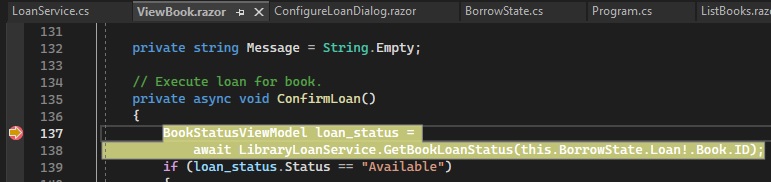
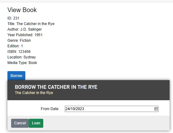
The rendered form for the above ConfigureLoanDialog Razor modal dialog is shown below:

Each of the Razor dialog component’s buttons events is of type EventCallback , which is bound to C# code event handlers within the parent Razor component.
Within the attribute tags of the <ConfigureLoanDialog..> element, the events OnCancel and OnConfirm are bound to the ConfirmLoan() and CancelLoan() event handler C# methods as shown:
<ConfigureLoanDialog Loan="BorrowState.Loan"
        OnCancel="CancelLoan"
        OnConfirm="ConfirmLoan" />
In the OnConfirm event, the ConfirmLoan() event handler is declared asynchronously to support the usage of asynchronous calls to the injected LoanService class as shown:
As we saw in the ConfirmLoan() event handler, there is one line of code that ensures that the parent Razor component is re-rendered after a state change. In this case, the properties within the BorrowState object changed, so we force rendering by making the call below:
this.StateHasChanged();
To connect a service to our parent Razor form, we injected the LoanService class using the @inject command as shown:
@inject ILoanService LibraryLoanService
The LoanService service class is shown below:
LoanService.cs
using BookLoanBlazorServerApp.Data;
using Microsoft.EntityFrameworkCore;
using BookLoanBlazorServerApp.Models;

namespace BookLoanBlazorServerApp.Services
{
    public class LoanService: ILoanService
    {
        private readonly IHttpClientFactory _clientFactory;
        private ApplicationDbContext _db;
        HttpContext _context;

        public LoanService(ApplicationDbContext db)
        {
            _db = db;
        }

        public async Task SaveLoan(LoanViewModel vm)
        {
            vm.DateCreated = DateTime.Now;
            vm.DateUpdated = DateTime.Now;

            await _db.Loans.AddAsync(vm);
            await _db.SaveChangesAsync();
        }

        public async Task<BookStatusViewModel> GetBookLoanStatus(int bookid)
        {
            BookStatusViewModel bsvm = new BookStatusViewModel() {
 			    Status = "N/A"
        };

        List<LoanViewModel> loans = await _db.Loans.
            Where(m => m.BookID == bookid).ToListAsync();

        if (!loans.Any())
            bsvm.Status = "Available";

        foreach (LoanViewModel rec in
            loans.OrderByDescending(a => a.DateLoaned))
            {
                bool foundState = false;
                bsvm.Borrower = rec.LoanedBy;
                bsvm.DateLoaned = rec.DateLoaned;
                bsvm.DateReturn = rec.DateReturn;
                bsvm.DateDue = rec.DateDue;

                if (DateTime.Now >= rec.DateReturn)
                {
                    bsvm.Status = "Available";
                    foundState = true;
                }
                if (DateTime.Now <= rec.DateDue)
                {
                    bsvm.Status = "On Loan";
                    if ((DateTime.Now > rec.DateReturn) &&
                        (rec.DateReturn.Year != 1))
                        bsvm.Status = "Available";
                    foundState = true;
                }
                if ((DateTime.Now > rec.DateDue) && (rec.DateDue.Year != 1))
                {
                    bsvm.Status = "Overdue";
                    foundState = true;
                }
                if (foundState)
                    break;
            }
            return bsvm;
        }
        …
    }
}
In the application bootstrap code, we mapped the interface and concrete service class through the service container as shown:
Program.cs
builder.Services.AddTransient<IBookService, BookService>();
builder.Services.AddTransient<BorrowState, BorrowState>();
builder.Services.AddTransient<ILoanService, LoanService>();
If you wondered how the custom dialogs are styled and rendered as modal dialogs over the parent forms, I will now explain how it is done as in the next section.
Dialog CSS Styles for Modal Custom Dialogs
In this section I will provide an overview of the CSS styles for the custom modal dialog, with explanations on the CSS properties that characterize a HTML dialog as a modal dialog. T
here are three main parts to a custom dialog and these the shown below:
The dialog title section consists of a heading and below that, a title.
The dialog title style is shown below, which gives us a light font, dark background, and generous padding from the ends of the text and the top and bottom of the text:
.dialog-title {
    background-color: #444;
    color: #fff2cc;
    padding: 1.3rem 2rem;
}
The dialog heading style is shown below, which gives us the same colour scheme and padding as the title, with a white font, upper cased font with larger font size:
.dialog-title h2 {
    color: white;
    font-size: 1.4rem;
    margin: 0;
    font-family: Arial, Helvetica, sans-serif;
    font-weight: bold;
    text-transform: uppercase;
    line-height: 1.3rem;
}
The dialog body section consists of the labels and input fields that receive data input from the user.
The dialog body style specifies an appropriate level of padding that idents the input and label fields to the right and with flex growth factor to allow the input controls to expand to fill available width space within the div:
.dialog-body {
    flex-grow: 1;
    padding: 0.5rem 3rem 1rem 0;
}

.dialog-body > div {
    display: flex;
    margin-top: 0.5rem;
    align-items: center;
}

.dialog-body label {
    text-align: right;
    width: 150px;
    margin: 0 1.5rem;
}

.dialog-body input {
    flex-grow: 1;
    width: unset;
}
The above CSS properties for padding, margins, and widths can be adjusted to accommodate application requirements.
The dialog footer contains the dialog buttons that allow the user to confirm or cancel the dialog.
The dialog button style, like the body has both buttons has flex layout with vertical alignment and a greyed background:
.dialog-buttons {
    height: 3rem;
    flex-shrink: 0;
    display: flex;
    align-items: center;
    background-color: #eee;
    padding: 0 1rem;
}
The dialog style, which I will explain is shown below:
.dialog {
    background-color: white;
    box-shadow: 0 0 15px rgba(0,0,0,0.6);
    display: flex;
    flex-direction: column;
    z-index: 1000;
    align-self: center;
    margin: auto;
    width: 600px;
    max-height: calc(100% - 3rem);
    animation: dialog-entry 0.5s;
    animation-timing-function: cubic-bezier(0.075, 0.820, 0.165, 1.000);
}
The z-index CSS property:
z-index: 1000;
is what renders the dialog with an overlay it in front of the existing HTML controls in the current page. A z-index of less than zero, such as -1 pushes the rendered dialog behind the current page HTML controls. A z-index of greater than zero brings the dialog in front of the current page HTML controls.
Below is the rendering we have when the z-index is negative and positive:

Use of the background color allows the dark colored fonts in the body to standout:
background-color: white;
If a background property not specified, the dialog will be transparent to the parent forms HTML content:

To give the 3-D effect of the dialog, we use the box-shadow property:
box-shadow: 0 0 15px rgba(0,0,0,0.6);
We go from sharp edges of the dialog box to the shadowed 3-D edges:
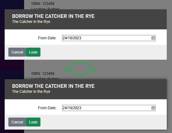
With the direction of control flow, we set the flex direction to column to ensure the three div elements within the dialog element are positioned in one column:
flex-direction: column;
Without the column flexing direction, the div elements will be positioned in a left to right flow within a single row as shown:
The dialog container style, which I will explain is shown below:
.dialog-container {
    position: absolute;
    top: 0;
    bottom: 0;
    left: 0;
    right: 0;
    background-color: rgba(0,0,0,0.5);
    z-index: 1000;
    display: flex;
    animation: dialog-container-entry 0.2s;
}
To ensure the dialog sits in the middle of the screen, we set the display property within the dialog container (which is the parent of the dialog) to flex as shown:
display: flex;
Below is the rendering we have when the dialog display is flex:

Setting the display of block would have resulted in the positioning of the dialog being moved to the top of the screen:

Setting the positioning to absolute fixes the positioning independently of the positioning of the button:
position: absolute;
Whereas setting it to relative would have shifted the dialog position to below where the markup was declared, which is undesirable. The effect of this is shown below:
The above commentary gives you an understanding of how custom modal dialogs are implemented, styled, and rendered within a .NET Core Blazor Server web application.
The ideas can be extended to implement some more complex dialogs, including those with drop downs, radio controls and validations.
That is all for today’s post.
I hope you have found this post useful and informative.
Andrew Halil is a blogger, author and software developer with expertise of many areas in the information technology industry including full-stack web and native cloud based development, test driven development and Devops.

