
Welcome to today’s post.
In today’s post I will discuss how to make your Angular application responsive.
As you would already be aware of, when we create an Angular application, it is not responsive by default.
We are provided with default libraries that give us basic HTML and a default CSS theme which is all we are given. The application will have some style but when we view the web application in a mobile or tablet device you will notice that unless you have made changes to the HTML to use responsive markup such as flex grids the page dimensions will not dynamically change to fit into the device view port.
To be able to make our Angular application responsive, we can use one of the following methods:
- Manually write CSS Flex styling to render our pages when the device and viewport size changes.
- Manually write CSS media queries that conditionally adjust sizes of HTML elements to fit the width of a resized screen.
- Install a responsive library that will provide responsive components with CSS3 into our application components.
Use of Manual CSS Flex Styling or CSS Media Queries
An example of 1 and 2 using CSS flex and media queries would be:
.flex-grid-col {
  display: flex;
}

@media (max-width: 500px) {
  .flex-grid-col {
    display: block;
  }
  .col {
    flex: 1;
  }
  .txt-col {
    flex: 2;
  }
}
In HTML we would use the styles to provide some flexibility to our DIV elements:
<div class="flex-grid-col" valign="top">
  <div class="col" style="text-align: left; padding-top:10px; padding-bottom:10px; margin-left:0; margin-right:0; text-align:center">
    <a>
      <img src=" img/my-img.jpg " style="width:auto; max-width:100%" />
    </a>
    <br />
    <br />
  </div>
  <div class="col" style="text-align:left;">
    <font size="3"><strong>Some text</strong></font>
    <br />
    <br />
    <font color="#000000">Coloured text </font>
  </div>
</div>
As you can see, this can be quite labor intensive and harder to maintain and understand the mark up. In addition, there are no standardized styles to use in our HTML.
Use of Responsive Bootstrap CSS Styling
To try 3, we can use a well-known theme called Bootstrap.
I will show how to integrate a library, ng-Bootstrap into your Angular application.
In your angular CLI, to install ng bootstrap, run the command:
ng add @ng-bootstrap/ng-bootstrap
Next, we can declare the bootstrap library within the app module. This is done as shown:
import { NgbModule } from '@ng-bootstrap/ng-bootstrap';

…
@NgModule({
  declarations: [
	…
  ],
  imports: [
    NgbModule,
    	…
  ],
  providers: [
    …
  ],
  bootstrap: [AppComponent]
})
export class AppModule { }
Next, add the CSS styles by installing the bootstrap NPM package as shown:
npm install bootstrap
Next, open the styles.scss file and add the following import to the bootstrap CSS:
@import "~bootstrap/scss/bootstrap.scss";
After we have applied the above changes to our application, we can implement bootstrap themed forms.
To convert our Material form controls to Bootstrap we can refer to the guide at https://www.w3schools.com/bootstrap/default.asp
In the example below we convert a Material edit input control’s HTML as shown:
<p>
  <mat-form-field class="example-full-width">
  <mat-label>Title</mat-label>
  <input [(ngModel)]="book.title" name="title" matInput
    placeholder="Title">
  </mat-form-field>
</p>
Buttons can be similarly converted from Material as shown:
<div class="example-button-row">
   <button mat-raised-button color="primary"
(click)="eventUpdateRecord($event.value)">Update</button>
</div>
And re-script it as a Bootstrap themed button control HTML with a tooltip as shown:
<div class="example-button-row">
   <button type="button" class="btn btn-primary"
(click)="eventUpdateRecord($event.value)">Update</button>
</div>
A Material dropdown-list which is shown below can also be converted:
<p>
  <mat-form-field class="example-full-width">
    <mat-label>Genre</mat-label>
    <mat-select [(ngModel)]="selectedGenre"
(selectionChange)="eventSelection($event.value)">
      <mat-option *ngFor="let genre of genres" [value]="genre">
        {{genre}}
      </mat-option>
    </mat-select>
  </mat-form-field>
</p>
The above can be re-scripted as a Bootstrap themed drop-down list control HTML as shown:
<div class="form-group">
  <label for="selectGenre1">Genre:</label>
  <br />
  <div ngbDropdown class="d-inline-block form-control col-sm-3"
      placement="right">
    <button
      style="margin-left: -10px; margin-top: -5px;"
      class="btn btn-outline-primary"  id="selectGenre1"
      ngbDropdownToggle>
      {{selectedGenre}}
    </button>
    <div name="selectGenre2" ngbDropdownMenu aria-
      labelledby="selectGenre1"
      ngDefaultControl [(ngModel)]="selectedGenre">
      <button ngbDropdownItem *ngFor="let genre of genres"
        [value]="genre" (click)="eventSelection($event)">
        {{genre}}
      </button>
    </div>
  </div>
</div>
The resulting conversion, when running in our browser and compared to the previous Material version is shown:
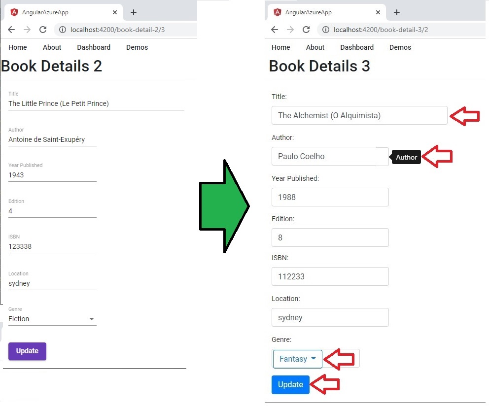
As we can see, the controls arrowed in red are the Bootstrap controls.
There are other useful ways we can use Bootstrap to provide a more responsive feel to our web pages including responsive menus.
As an exercise, try using other bootstrap controls such as the Toaster or Carousel in your forms or the Badge for notifications to enhance the look of your applications.
That’s all for today’s post.
I hope you found this post useful and informative.
Andrew Halil is a blogger, author and software developer with expertise of many areas in the information technology industry including full-stack web and native cloud based development, test driven development and Devops.
