
Welcome to today’s post.
I will be using the Angular Material control library help build a custom checkbox group control. With the Angular Material component library, we have at our disposal a checkbox control that can be extended to a collection of responsive checkbox controls that allow us to retrieve and set variables that are used within the current application component.
By ensuring checkbox group interface element is data dependent, we have a set of checkboxes that map to a set of objects that each have a description and a Boolean value. In addition, this improves our code re-use by providing a data-dependent checkbox group component that can be re-used whenever we have a variable selection of items that require to be selected by the user within a form component.
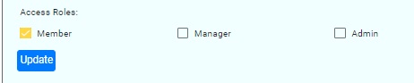
Below is the visual rendering of the component that we will build:
I will now go through the steps required to implement the component.
Implementation of the Checkbox Group Component
With our component, we start off by creating an empty component using scaffolding commands from the Angular CLI.
The component class with selector app-checkbox-group and imports from the Angular core library are as follows:
import { EventEmitter, Component, Input, OnInit, Output } from '@angular/core';

@Component({
selector: 'app-checkbox-group',
    templateUrl: './checkbox-group.component.html',
    styleUrls: ['./checkbox-group.component.scss']
})
export class CheckboxGroupComponent implements OnInit {

    …

}
Within the body of the component source, we define the component inputs as follows:
The available items are input using a getter and setter as shown:
private _availableItems: string[] = [];

@Input('availableItems')
set availableItems (value: string[])
{
    if (!value)
        return;

    this._availableItems = value;

    value.forEach(i =>
    {
        this.selectedItemsData.push({ description: i, isSelected: false });
    });
}

get availableItems()
{
    return this._availableItems;
}
The currently selection items are input using a getter and setter as shown:
@Input('selectedItems')
set selectedItems(value: string[])
{
    if (!value)
        return;
    value.forEach(s =>
    {
        const item = this.selectedItemsData.find(i => i.description === s);
        if (item)
          item.isSelected = true;
    });
}

get selectedItems()
{
    return this.selectedItemsData.map(v => v.description);
}

private selectedItemsData: SelectedItem[] = [];
Our component outputs are Event Emitters, which provide the selected and unselected items from the pool of available selection items.
The user selected output items are:
@Output() userSelectedItems: EventEmitter<string[]> = new EventEmitter();
The user un-selected output items are:
@Output() unSelectedUserItems: EventEmitter<string[]> = new EventEmitter();
Output for the above selected and unselected items are emitted whenever the user clicks any checkboxes (checks or unchecks):
updateChecked(value: any)
{
    this.userSelectedItems.emit(
        this.selectedItemsData.filter(i => i.isSelected === true).map(j => j.description)
    );
    this.unSelectedUserItems.emit(
        this.selectedItemsData.filter(i => i.isSelected === false).map(j => j.description)
    );
}
The storage of selected / unselected items allows us to store within the component which items are selected and those which are not selected.
export class SelectedItem
{
    public description: string;
    public isSelected: boolean;
}
Component HTML Template
To construct the visual part of the component, we construct the HTML template as shown:
<div style="display: flex;">
    <div name="selectionItems" style="flex: 0 20%;"
            *ngFor="let item of selectedItemsData">
        <mat-checkbox [(ngModel)]="item.isSelected"
                      [color]="blue"
                      [ngModelOptions]="{standalone: true}"
                      (ngModelChange)="updateChecked(item, $event)">
                      {{item.description}}
        </mat-checkbox>
    </div>
</div>
The above template contains a native Angular Material checkbox component that is iterated within an ngFor loop op the selected items of the component.
Consuming the Component
To consume the component, we define the HTML of the component with four parameters. Two of the parameters are input parameters and two are output parameters. The component is declared between HTML tags that correspond to the selector of the checkbox component.
The input parameters are bound as asynchronous observables and the outputs are event emitters triggering from user selections / clicks within the component:
<app-checkbox-group
    [availableItems]="availableRoles$ | async"
    [selectedItems]="selectedRoles$ | async"
    (userSelectedItems)="updateChecked($event)"
    (unSelectedUserItems)="updateUnChecked($event)">
</app-checkbox-group>
Another example on how we use asynchronous observables within an Angular application you can refer to my previous post on the RxJS Behavior Subject.
Variables to store selected and unselected items
These variables are used internally by our consumer application for the purposes of tracking the selected and unselected roles that are added or removed from the checkbox group.
userSelectedRoles: string[] = [];
userUnSelectedRoles: string[] = [];
Observables to bind selected and available data to component
These observables are initialized when the consumer component is initialized with the selected and available values sent to our component as inputs.
selectedRoles$: BehaviorSubject<string[]> = new BehaviorSubject<string[]>([]);
availableRoles$: BehaviorSubject<string[]> = new BehaviorSubject<string[]>([]);
Events to set selected and unselected items from emitted values from the component:
updateChecked(value: string[])
{
    this.userSelectedRoles = value;
}

updateUnChecked(value: string[])
{
    this.userUnSelectedRoles = value;
}
Initialization of data in parent component
To initialize to inputs for the component we supply the following:
- Available items that can be selected.
- Currently selected items (if any).
ngOnInit() {
	…

    this.availableRoles$.next([‘Member’, ‘Manager’, ‘Admin’]);

    this.selectedRoles$.next([`Member`]);

    this.userSelectedRoles = [ ‘Member’ ];
    this.userUnSelectedRoles = [ ‘Manager, ’Admin’ ];
}
If our application was managing a set of user roles then we would initialise assign the current user’s role to the component’s selectedItems input and assign all available user roles to the component’s availableItems input.
In the above initialization the component’s initial state would have a Member item checked and the Manager and Admin items unchecked.
That’s all for today’s post.
I hope you enjoyed today’s post and found it useful and informative.
Andrew Halil is a blogger, author and software developer with expertise of many areas in the information technology industry including full-stack web and native cloud based development, test driven development and Devops.

