
Welcome to today’s post.
Today I will discuss form validations in template implemented Angular forms.
I will be giving examples of the following types of validations:
- Built-in validations
- Custom validations
- Preventative form validations
- Non-preventative form validations
I will also give an overview of the implementation for each type of validation.
Bear in mind that UI based validations are just the first layer of protection before your data is submitted across to a backend database or web API. There should also be sufficient validations being implemented on your backend API methods to prevent edge cases leading to undesirable errors that affect application stability, usability, and security.
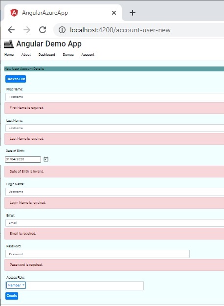
Basic Input Validations
The most basic validation attributes for an input control within a template form will cover many of the validation needs of a basic application.
I will give an overview and example. Suppose our basic input control within any validation is shown below:
<div class="form-group">
    <label for="firstname">First Name:</label>
    <input [(ngModel)]="useraccount.firstname" name="firstname"
        class="form-control col-sm-6" placeholder="Firstname"
        placement="right" ngbTooltip="Enter first name">
</div>
We will then add some validations to the input edit control.
To make an input field compulsory, we add the required attribute:
<div class="form-group">
    <label for="firstname">First Name:</label>
    <input [(ngModel)]="useraccount.firstname" name="firstname"
        class="form-control col-sm-6" required placeholder="Firstname"
        placement="right" ngbTooltip="Enter first name">
</div>
To restrict your input widths, we use the minlength and maxlength attributes:
<div class="form-group">
    <label for="firstname">First Name:</label>
    <input [(ngModel)]="useraccount.firstname" name="firstname"
        class="form-control col-sm-6" required placeholder="Firstname"
        minlength="2" maxlength="50"
        placement="right" ngbTooltip="Enter first name">
</div>
For our input control errors to be recognized by the form’s validation checker we export NgModel into a template variable with the same name as the control:
<div class="form-group">
    <label for="firstname">First Name:</label>
    <input [(ngModel)]="useraccount.firstname" name="firstname"
        class="form-control col-sm-6" required placeholder="Firstname"
        minlength="2" maxlength="50" #firstname="ngModel"
        placement="right" ngbTooltip="Enter first name">
</div>
We now implement logic to check and display the validation error messages. Below are the two validations for required and minlength.
I have deliberately excluded validation for maxlength as the input control does not allow character lengths past the specified maximum so the validation error condition will not be reached:
<div *ngIf="firstname.invalid && firstname.errors &&
firstname.errors.required && (firstname.dirty || firstname.touched)">
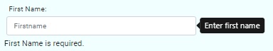
First Name is required.
</div>
<div *ngIf="firstname.invalid && firstname.errors && firstname.errors.minlength &&
(firstname.dirty || firstname.touched)">
First Name length must be at least 2 characters.
</div>
When we run the form and test the validation by entering the field and tabbing off it, the required validation error appears:
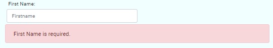
The error has no styling, so we can use apply an appropriate style for any errors. Furthermore, we can apply the styling whenever the field in invalid (with at least one error) and it has been modified (dirty or touched).
<div *ngIf="firstname.invalid && (firstname.dirty ||
        firstname.touched)" class="alert alert-danger">
    <div *ngIf="firstname.errors.required">
        First Name is required.
    </div>
    <div *ngIf="firstname.errors.minlength">
        First Name length must be at least 2 characters.
    </div>
</div>
Notice that when the invalid property of the control is true, the errors array is non-empty, so there is no need to check for the error to be undefined.
When the application is re-run and we re-test the validation, the error styles render as expected:
We have just seen how to use the simpler validations which ensure a value has been entered within a control (a required validation), and those that ensure that a range of values has been entered within a control (a range validation). In the next section, I will go other another type of validation, which are custom validations.
When the need for custom validations arises
The complexity of the validation increases, the need for a customized form of validation will then be required for a control.
Examples of a customized validation might be:
- Checking a date field excludes specific days, months, or days of the week.
- Checking a numeric value based on additional configurations outside of the form.
- Checking a text value is valid against a data or dictionary store.
The example of a customized validation I will demonstrate is based on the Material Date Picker UI and an HTML input to store the selected date value. The date we will validate is a date of birth within a user account model and the custom condition is to ensure that the date is no later than the current date.
The example is using a HTML template for the form controls.
The HTML script for the date is shown:
<div class="form-group">
    <label for="dob">Date of Birth:</label>
    <br />
    <input matInput [matDatepicker]="picker" name="dob"
   		appDateOfBirth={{useraccount.dob}}
        [(ngModel)]="useraccount.dob"
        (dateInput)="addEvent('input', $event)"
        (dateChange)="addEvent('change', $event)" #dob="ngModel">
    <mat-datepicker-toggle matSuffix [for]="picker">
   	</mat-datepicker-toggle>
    <mat-datepicker #picker startAt="{{useraccount.dob}}">
   	</mat-datepicker>
</div>
In our HTML input, the custom validation selector is appDateOfBirth with the currently selected user account date of birth {{useraccount.dob}} as the value we wish to test against the validator function:
<input matInput [matDatepicker]="picker" name="dob"
	appDateOfBirth={{useraccount.dob}}
To be able to check validity within the HTML template, we also export the template variable #dob as ngModel:
<input matInput [matDatepicker]="picker" name="dob"
    appDateOfBirth={{useraccount.dob}}
    [(ngModel)]="useraccount.dob"
            . . .
   	#dob="ngModel">
The selector we declared within the HTML is recognizable if we define a directive within NG_VALIDATORS so that our validation class ForbiddenDateOfBirthDirective is a validation provider. The validate() function then calls our custom function to test the value within our control.
import { Directive, Input } from "@angular/core";
import { AbstractControl, NG_VALIDATORS, Validator, ValidatorFn } from "@angular/forms";

@Directive({
  selector: '[appDateOfBirth][ngModel]',
  providers: [{provide: NG_VALIDATORS, useExisting: ForbiddenDateOfBirthDirective,
      multi: true}]
})

export class ForbiddenDateOfBirthDirective implements Validator {
  @Input('appDateOfBirth') forbiddenDateOfBirth: string;

  validate(control: AbstractControl): {[value: string]: any} | null {
    return this.forbiddenDateOfBirth ?
      dateOfBirthValidator(new Date(this.forbiddenDateOfBirth))(control): null;
  }
}
To complete our custom validator, we implement an exported function to check the date within the input control:
export function dateOfBirthValidator(dobVal: Date): ValidatorFn {
    return (control: AbstractControl): {[key: string]: any} | null => {
      const isForbiddenDob =
          control.value ?
          control.value.getTime().valueOf() >= (new Date()).getTime().valueOf():
          false;
      return isForbiddenDob ? {forbiddenDateOfBirth: {value: control.value}} : null;
    };
}
The validation function doesn’t have an argument, however the binding value {{useraccount.dob}} that was assigned to our selector appDateOfBirth is returned as a control if control.value satisfies the custom condition (the invalid condition), or it returns null if the condition does not satisfy the custom condition (the valid condition).
The errors array property for the input control contains the return parameter for our custom validator and it can be checked within the HTML template like we do for build-in validators:
<div *ngIf="dob.invalid" class="alert alert-danger">
<div *ngIf="dob.errors.forbiddenDateOfBirth">
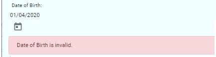
Date of Birth is invalid.
</div>
</div>
In addition, we will need to declare our custom validator directive within the Ng Module:
@NgModule({
  declarations: [
	. . .
    ForbiddenDateOfBirthDirective
  ],
  imports: [
  ],
  providers: [
  ],
  bootstrap: [AppComponent]
})
export class AppModule { }
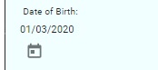
After we have put these pieces together, run our application and test our date validation, a valid date shows as follows:
When a future date is selected the validator kicks in showing the error message and styling:
In the next two sections, I will show how to implement preventative and non-preventative form validations.
Preventative form validations
Preventative form validations are validations we use to prevent a user from submitting the form to the server. This includes hiding or disabling submission controls that should only become active once all the form controls have valid user input.
One further validation we can make before we display the submission controls is to check if the form has at least one error:
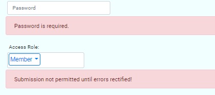
These are just conditions to test for form validity:
<div *ngIf="!userForm.valid" class="alert alert-danger">
    Submission not permitted until errors rectified!
</div>
<div *ngIf="userForm.valid">
    <button type="button"
        class="btn btn-primary"
        id="btnCreate"
        (click)="eventCreateRecord($event.value)">
        Create
    </button>
</div>
This will require us to declare a template variable for the form:
<form #userForm="ngForm">
I will show how to use non-preventative form validations in the next section.
Non-preventative form validations
Non-preventative form validations are validations we use to display outstanding form input control errors to the user after they have attempted a submission. Unlike preventative form validations, we do not prevent the user from submitting, however when the submission does take place the form displays ALL outstanding errors and stops the submission to the server from occurring.
To implement non-preventative form validation in our submission event handler we set a submission flag and a code guard to exit before any server APIs are called:
this.submitted = true;

if (!this.form.valid)
    return;
After our server API has been called, we than reset the submission back to false.
The conditional error display HTML for each control is then amended slightly to display whenever the submission has been made:
<div *ngIf="firstname.invalid &&
   	(firstname.dirty || firstname.touched || submitted)"
    class="alert alert-danger">
		. . .
</div>
Whichever method you decide to use is dependent on your UI requirement.
That is all for today.
I hope you found this post useful and informative.
Andrew Halil is a blogger, author and software developer with expertise of many areas in the information technology industry including full-stack web and native cloud based development, test driven development and Devops.