
Welcome to today’s post.
In today’s post I will show you how we can create a useful tiled dashboard menu component using CSS Grids and the tiled pattern user interface pattern.
Most of you are familiar with the horizontal menus we experience within a web application, and the corresponding responsive menu when rendered on a mobile device.
What are Tiled Menus?
A tiled menu consists of one or more tiles, or rectangular cards that are arranged from left to right on a screen and wrapped over to the next line until all the cards are displayed.
Each card has its own heading, with possibly an icon, a URL link, and a description of what form the menu card accesses through the URL link.
In terms of application usability, a tiled menu dashboard is useful when we run out of sub-menu item space in our menu bars. Typically, when the menu items underneath a menu bar reach the bottom of the screen, we then implement one of the following methods to displaying the excess of menu items:
- Move menu items into another menu sub-item, OR
- Move the menu options into another screen as tiled menu items.
Not only is this a useful interface usability pattern, but also a navigational pattern. Instead of having navigation links within concealed menu items, we move the navigational links to more visible tiled menus.
Tiled menu items are also responsive in that they can wrap over onto the next line when the screen width is reduced.
Going from Menu Bars and Sub-Menus to Tiled Menus
Once we reach a high number of menu bars that cannot fit onto our horizontal screen, we don’t just run out of space in our screen, our application also slows down when we try to pre-load all of the components associated with these menu items. In a previous post I showed how to speed up module loading using a design pattern called lazy loading. By moving the access to our menu items into a menu dashboard, then create each dashboard menu as a lazy-loaded feature module, we gain the benefit of only loading each logical set of menu items when they are accessed.
So, for example, we have the menu bar categories shown below:
Accounts
Books
Loans
Reports
Under each of these menu bar categories we have sub-menu items (indented) as shown:
Accounts
List Accounts
Search Accounts
New Account
Update Account
Remove Account
Books
List Books
Search Books
New Book
Update Book
Remove Book
Loans
Search Loan
Borrow Book
Return Book
Reports
Membership List
Summary Report
Overdue Loans Report
Loaned Books Report
Each of the above four menu categories can be moved into their own dashboard tile menu within its own dedicated feature module.
For the Books module I will show how this is done.
Implementation of a Tiled Menu Component
In this section I will show how to create a basic tiles menu component.
First, we define a tile class to hold the properties of a tile menu:
export class TileItem {
    text: string;
    link?: string;
    icon?: string;
    description: string;

    constructor(text: string, link: string, icon: string, description: string)
    {
        this.text = text;
        this.link = link;
        this.icon = icon;
        this.description = description;
    }

    clone(value: TileItem)
    {
        return new TileItem(
            value.text,
            value.link,
            value.icon,
            value.description);
    }
}
We then implement the tile menu component. The HTML template definition is shown below:
tiled-menu.component.html
<div class="item-toolbar">
    <div class="row text-center align-items-center h-100"
        style="margin-left: 1px;">
      <button (click)="goBack()">Back</button>
    </div>
</div>

<div class="tiled-menu-grid-container">
    <div *ngFor="let tile of menuItems" style="cursor: pointer;">
        <div class="card p-3" (click)="onSelectedreport(tile)">
            <div class="tile-menu-title">
               <i class="{{tile.icon}}"></i>
               <span class="tile-menu-header">{{tile.text}}</span>
            </div>
            <hr />
            <p>{{tile.description}}</p>
        </div>
    </div>
</div>
The HTML dynamically iterates through all menu items, rendering them as cards with a heading, URL action link, and description.
Styling a Tiled Menu Component
The CSS styling of the grid uses CSS-Grid, which allows us to position each tile within a grid layout. The CSS definition is shown below:
tiled-menu.component.scss
.tiled-menu-grid-container {
    display: grid;
    grid-template-columns: repeat(2, max-content);
    grid-template-rows: repeat(max-content);
    column-gap: 5px;
    row-gap: 0px;
    margin-top: 20px;
}

.tile-menu-header {
    vertical-align: top;
    margin-left: 10px;
    font-size: 1.25em;
    font-weight: 500;
}

.tile-menu-title
{
    background-color: cadetblue;
}

.card {
    &:hover  {
        background: lightblue;
    }
    background-color: beige;
    align-self: stretch;
    width: 320px;
    height: 160px;
}
We use the CSS grid’s repeat() function to allow a variable number of tiled grid items to be laid out from left to right, and wrapped over to the next line when the number of columns exceeds 2 for each row. This is achieved when defining the grid-template-columns property:
grid-template-columns: repeat(2, max-content);
The grid rows expand until all grid items are used up. This is done using the grid-template-rows property:
grid-template-rows: repeat(max-content)
Initialization Parameters of the Tiled Component
The component source is basically an input property, menuItems which a list of menu tile items, which are set within the container parent component. It contains an event handler for the hyperlink click and an event handler to go back to the previous browser page.
tiled-menu.component.ts
import { Component, Input, OnInit } from '@angular/core';
import { TileItem } from '../../models/TileItem';
import { Router } from '@angular/router';
import { Location } from '@angular/common';

@Component({
  selector: 'app-tiled-menu',
  templateUrl: './tiled-menu.component.html',
  styleUrls: ['./tiled-menu.component.scss']
})
export class TiledMenuComponent implements OnInit {
  private _menuItems: TileItem[] = [];
  @Input('menuItems')
  set menuItems(value: TileItem[])
  {
      if (!value)
        return;

      this._menuItems = value;
  }
  get menuItems()
  {
      return this._menuItems;
  }

  constructor(private router: Router,
    private location: Location) {
  }

  ngOnInit() {
  }

  ngOnDestroy() {
  }

  onSelectedreport(e: TileItem) {
    this.router.navigate([e.link]);
  }

  goBack() {
    this.location.back();
  }
}
In the next section, I will show how to declare and export the tiled menu component so that it can be re-used within the application for multiple dashboard menus.
Declaring and Exporting the Tiled Menu Component from a Component Module
The tiled menu component is then added to and exported out of a component module.
component.module.ts:
import { NgModule } from '@angular/core';
import { CommonModule } from '@angular/common';
…
import { TiledMenuComponent } from
   '../components/tiled-menu/tiled-menu.component';

@NgModule({
  declarations: [
    …
    TiledMenuComponent
  ],
  imports: [
    CommonModule,
    …
  ],
  exports:
  [
    TiledMenuComponent,
    …
  ]
})
export class ComponentsModule { }
In the next section, I will show how to load the tiled menu component efficiently when required within the application.
Lazy Loading the Tiled Menu Component from the Router Module
Our app routing module is then used to lazy load the dashboard feature modules.
app-routing.module.ts:
import { NgModule } from '@angular/core';
import { Routes, RouterModule } from '@angular/router';
…
import { AboutComponent } from './about/about.component';
import { HomeComponent } from './home/home.component';
import { AuthGuard } from './security/auth.guard';
import { LoginComponent } from './login/login.component';

const routes: Routes = [
  { path: 'home', component: HomeComponent, canActivate: [AuthGuard] },
  { path: '', redirectTo: 'home', pathMatch: 'prefix'},
  { path: 'login', component: LoginComponent },
  { path: 'about', component: AboutComponent },
    …
  { path: 'dashboards', loadChildren: () =>
    import('../app/dashboards/dashboards.module')
        .then(m => m.DashboardsModule)
  },
  …
];

@NgModule({
  imports: [RouterModule.forRoot(routes)],
  exports: [RouterModule]
})
export class AppRoutingModule { }
In the next section, I will show how to re-use the tiled menu component to create a customized tile menu component.
Defining Custom Menus and Links using the Tile Menu Component
We then implement a books dashboard item component that makes use of our tile menu component.
The HTML that includes the tiled menu component is shown below:
books-dashboard.component.html:
<app-tiled-menu [menuItems]="tiles"></app-tiled-menu>
Our dashboard code is shown with the tile menus being appended to the menuItems property within ngOnInit().
books-dashboard.component.ts:
import { Component, OnInit } from '@angular/core';
import { TileItem } from '../../models/TileItem';
import { Router } from '@angular/router';

@Component({
  selector: 'app-books-dashboard',
  templateUrl: './books-dashboard.component.html',
  styleUrls: ['./books-dashboard.component.scss']
})
export class BooksDashboardComponent implements OnInit {

  tiles: TileItem[] = [];

  constructor(private router: Router) {
  }

  ngOnInit() {
    console.log("opening books dashboard..");

    var bookListTile = new TileItem(
        "Book Lists Form",
        "/book/books",
        "far fa-list-alt",
        "Book List shows all books in library catalog with detail links."
    );
    this.tiles.push(bookListTile);

    var bookExpandableListTile = new TileItem(
        "Book Expandable Lists Form",
        "/book/books-list",
        "far fa-list-alt",
        "Book List shows all book records with inline expandable detail panels in library catalog with detail links."
    );
    this.tiles.push(bookExpandableListTile);

    var bookSearchTile = new TileItem(
        "Book Search Form",
        "/book/books-list",
        "far fa-list-alt",
        "Book Search allows incremental searches to be performed."
    );
    this.tiles.push(bookSearchTile);

    var bookDashboardReportTile = new TileItem(
        "Book Dashboard Report",
        "/dashboards/summary-dashboard",
        "fal fa-analytics",
        "Book Dashboard Report showing summaries of top 5 books loaned, top 5 borrowers and overdue loans."
    );
    this.tiles.push(bookDashboardReportTile);
  }

  ngOnDestroy() {
  }

  onSelectedreport(e: TileItem){
      this.router.navigate([e.link]);
  }
}
In the DashboardsModule module we then declare the route to the books dashboard menu as shown:
const routes: Routes = [
  { path: 'books-dashboard', component: BooksDashboardComponent },
  ..
];
The dashboard configuration is shown below:
import { NgModule } from '@angular/core';
import { FormsModule } from '@angular/forms';
import { CommonModule } from '@angular/common';
import { Routes, RouterModule } from '@angular/router';
import { MaterialModule } from '../material/material.module';
import { BooksDashboardComponent } from './books-dashboard/books-dashboard.component';
import { SummaryDashboardComponent } from './summary-dashboard/summary-dashboard.component';
import { ComponentsModule } from '../components/components.module';

const routes: Routes = [
  { path: 'books-dashboard', component: BooksDashboardComponent },
  { path: 'summary-dashboard', component: SummaryDashboardComponent }
];

@NgModule({
  declarations: [
    BooksDashboardComponent,
    …
  ],
  imports: [
    FormsModule,
    CommonModule,
    RouterModule.forChild(routes),
    ComponentsModule,
    MaterialModule
  ],
  exports: [
    RouterModule
  ],
  entryComponents: [
  ]
})
export class DashboardsModule {
}
When we run the application and navigate to the dashboard, the tiled menus will look as shown:
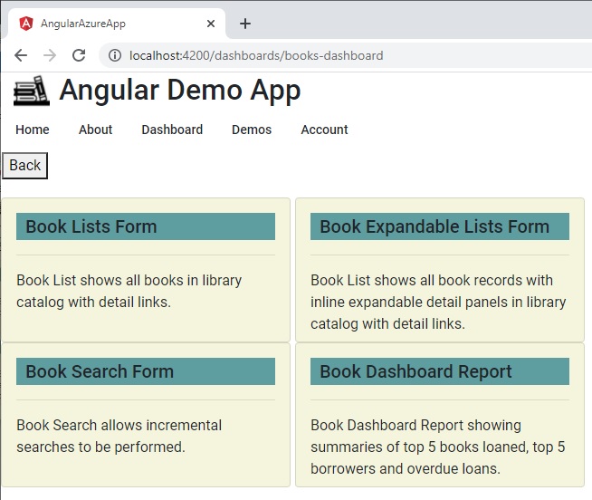
You can see that using the menu item dashboard component has allowed us to add menu items quite easily using the book dashboard component.
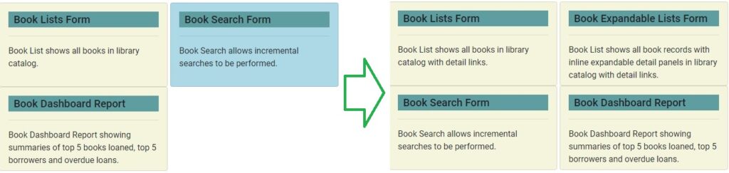
The tiling user interface pattern ensures additional tiles are dynamically inserted into the grid with the maximum columns remaining unchanged whilst the number of rows increases as additional tiles are inserted or appended into the tile list. This is shown in the screen shot below:
As an additional task, you can extend the above tiled menu items look and feel by including icons in the heading of each tile. The resulting menu items will look as follows:
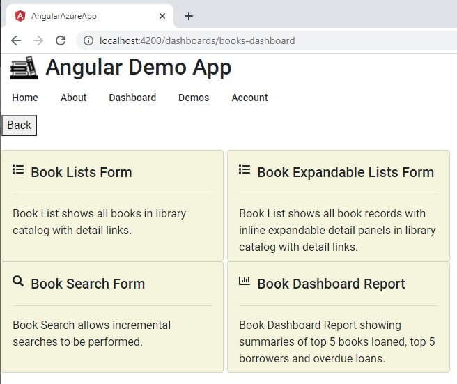
In the tiled item definitions, I used Font Awesome font icons. For more details on how to integrate these into your Angular applications, refer to my previous post on using Font Awesome font icons in Angular applications.
That is all for today’s post.
I hope you found this post useful and informative.
Andrew Halil is a blogger, author and software developer with expertise of many areas in the information technology industry including full-stack web and native cloud based development, test driven development and Devops.

