
Welcome to today’s blog.
In today’s post I will be showing how to use Angular Material tables in an application.
As a user design element, tables are a useful way of displaying data that is structured in rows and columns. These can include records that are imported from a data file and displayed to the end user. The data presented within the table can be a read-only format report, or it can be editable within a data entry form.
In today’s post I will show how to implement tables of the following characteristics and features:
- A basic read-only table with rows, columns, and column headers.
- A read-only table with columns that are sortable in ascending or descending order.
- A table with drop-down lists on a column, allowing column data to be modifiable.
To be able to use Material tables with the above features within an Angular application requires as a minimum the importation of the following modules from the Material table and sort packages:
import { MatSortModule } from '@angular/material/sort';
import { MatTableModule } from '@angular/material/table';
In addition, the following types are required to be imported within each component that uses Material tables and column sorting:
import { MatSort } from '@angular/material/sort';
import { MatTableDataSource } from '@angular/material/table';
In the next section, I will show how to display a table from a data source.
Displaying a Table using a Data Source
In our first example, we can see how Material tables are created within the HTML template, with each column definition wrapped within an <ng-container> tag. Within the container is a header cell that contains the column header name and a cell that contains the cell value that consists of the current value of the record column’s value.
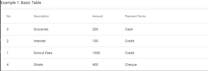
<p>Example 1: Basic Table</p>

<table mat-table [dataSource]="dataSource" class="mat-elevation-z8">
    <!-- Position Column -->
    <ng-container matColumnDef="position">
        <th mat-header-cell *matHeaderCellDef> No. </th>
        <td mat-cell *matCellDef="let element"> {{element.position}} </td>
    </ng-container>

    <!-- Desc Column -->
    <ng-container matColumnDef="desc">
        <th mat-header-cell *matHeaderCellDef> Description </th>
        <td mat-cell *matCellDef="let element"> {{element.desc}} </td>
    </ng-container>

    <!-- Amount Column -->
    <ng-container matColumnDef="amount">
        <th mat-header-cell *matHeaderCellDef> Amount </th>
        <td mat-cell *matCellDef="let element"> {{element.amount}} </td>
    </ng-container>

    <!-- Terms Column -->
    <ng-container matColumnDef="paymentterms">
        <th mat-header-cell *matHeaderCellDef> Payment Terms </th>
        <td mat-cell *matCellDef="let element"> {{element.paymentterms}} </td>
    </ng-container>

    <tr mat-header-row *matHeaderRowDef="displayedColumns"></tr>
    <tr mat-row *matRowDef="let row; columns: displayedColumns;"></tr>
</table>
The above table column and row data elements are derived from a data source, which can be obtained from a TypeScript class or interface.
The data interface structure for the above table columns is shown below:
export interface PaymentData
{
    position: number;
    desc: string;
    amount: number;
    paymentterms: string;
}
The column names in our table are taken from the property members, with row data values taken from each property value within each instance of the data interface PaymentData.
Below is a sample JSON data array that has been created with typed instances of the above structure:
PAYMENT_DATA: PaymentData[] = [
    { position: 1, desc: 'School Fees', amount: 1000, paymentterms: 'Credit'},
    { position: 2, desc: 'Internet', amount: 100, paymentterms: 'Credit'},
    { position: 3, desc: 'Groceries', amount: 200, paymentterms: 'Cash'},
    { position: 4, desc: 'Strata', amount: 400, paymentterms: 'Cheque'},
];
The data source variable will then be used to bond to the table data. It is declared below:
dataSource: MatTableDataSource<PaymentData>;
Within the constructor we can initialize the table data source as shown:
constructor() {
    this.dataSource = new MatTableDataSource(this.PAYMENT_DATA);
}
The variables required to hold the table data source and displayed columns as a string array are shown below:
displayedColumns: string[] = ['position', 'desc', 'amount', 'paymentterms'];
When our component runs and is rendered, we see the table and the array data presented as follows:
In the next section, I will show how to add column sorting to our table.
Adding Column Sorting to our Table
We can add sorting features to our table using the MatSort component, which allows us to sort the table records from the columns.
The sorting allows us to apply the following types of sort ordering:
- Ascending
- Descending
To be able to use MatSort within our HTML template, we are required to declare an instance of MatSort as a child within our component source as shown:
@ViewChild(MatSort) sort: MatSort;
After our component is initialized, the sort for our data source is initialized with the following excerpt:
ngAfterViewInit()
{
    this.dataSource.sort = this.sort;
}
Our HTML table definition requires the following changes:
- Add the matSort attribute to the <table mat-table ..> tag.
- Add the mat-sort-header attribute to each column’s <th mat-header-cell …> tag that you want to add columnar sorting.
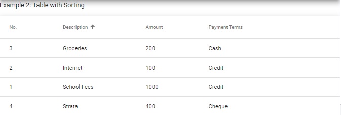
Below is our table, enhanced with sorting:
<p>Example 2: Table with Sorting</p>

<table mat-table [dataSource]="dataSource" class="mat-elevation-z8" matSort>
    <!-- Position Column -->
    <ng-container matColumnDef="position">
        <th mat-header-cell *matHeaderCellDef mat-sort-header> No. </th>
        <td mat-cell *matCellDef="let element"> {{element.position}} </td>
    </ng-container>

    <!-- Desc Column -->
    <ng-container matColumnDef="desc">
        <th mat-header-cell *matHeaderCellDef mat-sort-header>
 		    Description
        </th>
        <td mat-cell *matCellDef="let element">
            {{element.desc}}
        </td>
    </ng-container>

    <!-- Amount Column -->
    <ng-container matColumnDef="amount">
        <th mat-header-cell *matHeaderCellDef mat-sort-header> Amount </th>
        <td mat-cell *matCellDef="let element"> {{element.amount}} </td>
    </ng-container>

    <!-- Terms Column -->
    <ng-container matColumnDef="paymentterms">
        <th mat-header-cell *matHeaderCellDef mat-sort-header>
 		    Payment Terms
        </th>
        <td mat-cell *matCellDef="let element">
 		    {{element.paymentterms}}
 	    </td>
    </ng-container>

    <tr mat-header-row *matHeaderRowDef="displayedColumns"></tr>
    <tr mat-row *matRowDef="let row; columns: displayedColumns;"></tr>
</table>
When the table is refreshed, the column sorting shows with an up arrow for ascending sorting, and a down arrow for descending sorting as shown:
In the next section I will show how to add drop-down controls within table columns.
Adding Drop Down Controls within Table Columns
One useful feature is the ability to select multiple values within our columns. This is achieved by binding a drop-down list to a column.
In the table example, we can bind a drop-down list to the Terms column as shown:
<!-- Terms Column -->
<ng-container matColumnDef="paymentterms">
    <th mat-header-cell *matHeaderCellDef mat-sort-header>
        Payment Terms
    </th>
    <td mat-cell *matCellDef="let element">
        <mat-form-field floatLabel="never"
            appearance="outline" [style.width.px]=150>
            <mat-select placeholder="Payment Type" name="paymentType"
                [(value)]="element.paymentterms">
                <mat-option *ngFor="let paymentType of PaymentMethods"
                    [value]="paymentType.name">
                    {{paymentType.name}}
                </mat-option>
            </mat-select>
        </mat-form-field>
    </td>
</ng-container>
The drop-down list’s selectable options are generated from an ngFor directive as shown:
<mat-option *ngFor="let paymentType of PaymentMethods"
    [value]="paymentType.name">
    {{paymentType.name}}
</mat-option>
Where the PaymentMethods array has the name property for the selected payment type as shown:
PaymentMethods: any[] = [
    { name: 'Credit' },
    { name: 'Cash' },
    { name: 'Pay Pal' },
    { name: 'Cheque' }
];
With the above HTML definition for the drop-down list, each drop down in a row has a default selection that is set using the value input attribute from the current data as shown:
<mat-select placeholder="Payment Type"
    name="paymentType"
	[(value)]="element.paymentterms">
Where the currently stored payment term is the paymentterms property within each instance as shown:
PAYMENT_DATA: PaymentData[] = [
    { position: 1, desc: 'School Fees', amount: 1000, paymentterms: 'Credit'},
    { position: 2, desc: 'Internet', amount: 100, paymentterms: 'Credit'},
    { position: 3, desc: 'Groceries', amount: 200, paymentterms: 'Cash'},
    { position: 4, desc: 'Strata', amount: 400, paymentterms: 'Cheque'},
];
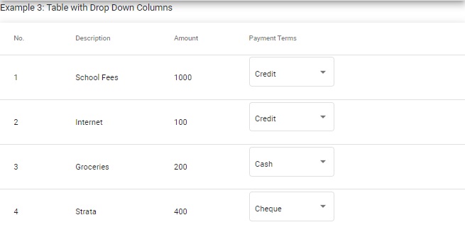
Upon rendering, each drop down lists has the default selected value displayed as shown:
On selecting one of the drop-down controls, the default selected item shows within the drop-down list as shown:
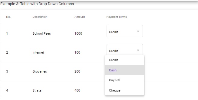
The value attribute is a two-way binding for getting the current paymentterms property value and for setting the same property value when selected from the drop-down list. Once the property is updated within the data source. This is ideal for data entry of our Material table component.
For more details on the Material table component, refer to the Angular Material components sub-site.
Angular Material tables can be used for the following useful purposes:
- Displaying report data.
- Data entry of loaded application data.
That is all for today’s post.
I hope you have found this post useful and informative.
Andrew Halil is a blogger, author and software developer with expertise of many areas in the information technology industry including full-stack web and native cloud based development, test driven development and Devops.

