
Welcome to today’s post.
In today’s post I will be discussing the Material autocomplete component and how to use it within an Angular component within an application.
Where autocompletion becomes most useful within an application is when we want to apply a search through many records and return a finite number of matching entries in the result. From a usability perspective, we want to avoid having to scroll through hundreds of entries in a drop-down list box to locate a particular entry. An auto-completion search strategy provides a short-cut for the user in obtaining the desired entry. Where there is a search field within a data set that contains lengthy text, most users do not recall the exact phrase they want to locate. Even though the user could recall the exact phrase, the actions to type in the exact matching phrase are time-consuming (and repetitive) for the user. For this reason, the desirability of an efficient search is to incrementally submit a search for a substring we build for each subsequently entered keystroke.
I will first start off my showing how to use the component with a basic incremental drop-down filter of fixed string options.
I will then show how to connect the incremental search filter to an API backend data source that has a structured class array.
In the first section I will show how to import the Material auto complete module from the Angular Material library.
Importing the Material Auto-Completion Module
import { NgModule } from '@angular/core';
import { CommonModule } from '@angular/common';

…

import { MatAutocompleteModule } from '@angular/material/autocomplete';

@NgModule({
  imports: [
    …
    MatAutocompleteModule
  ],
  exports: [
    …
    MatAutocompleteModule
  ],
  …
})
export class MaterialModule { }
Next, I will show a basic example of incremental filtering.
Setting up the Incremental Search
Below is some data that will be used for incremental search:
options: string[] = [
    'One', 'Two', 'Three', 'Four', 'Five', 'Six', 'Seven', 'Eight', 'Nine',
    'Ten', 'Eleven', 'Twelve', 'Thirteen', 'Fourteen', 'Fifteen', 'Sixteen',
    'Seventeen', 'Eighteen', 'Nineteen', 'Twenty'
];
We will need the following variables to store our incremental search:
hasSearchResults$ = new BehaviorSubject<boolean>(false);
filteredOptions: Observable<string[]>;
and a form control instance for our input control that is bound to the incremental search:
myControl = new FormControl();
To filter the above data, we can use the ECMA script standard filter() function to filter out an entered text as a substring from the options array data:
private _filter(value: string): string[] {
  const filterValue = value.toLowerCase();
  return this.options
             .filter(option => option.toLowerCase()
             .includes(filterValue));
}
When our auto-completion input entered text changes, the corresponding formControl property detects changes with the valueChanges property, which we then pipe and map to our filter function:
ngOnInit() {
  this.filteredOptions = this.myControl.valueChanges
    .pipe(
      startWith(''),
      map(value => this._filter(value)),
    );
}
The startWith() RxJS operator is used to emit a initial value before subscribing to the source observable, which is the stream of changes from the input control.
Our HTML template will need an <input> input control and a <mat-autocomplete> auto-completion control to incrementally filter the text data that the user types into the input control. The input control is associated with the auto-complete control through the input control’s [matAutocomplete] property and the #auto template reference variable in the auto-complete control. This is exhibited below:
<mat-card>
    <mat-card-title>
    </mat-card-title>

    <mat-card-content>
        <div id="heading" class="heading">Incremental Book Search</div>
    </mat-card-content>

    <mat-card-content>
        <mat-form-field class="example-full-width">
            <mat-label>Search Text</mat-label>
            <input  class="form-control"
                    type="text"
                    name="userQuery"
                    id="userQuerys"
                    [formControl]="myControl"
                    [matAutocomplete]="auto"
                    matInput>
        </mat-form-field>

        <mat-autocomplete #auto="matAutocomplete">
            <mat-option *ngFor="let option of filteredOptions | async" [value]="option">
              {{option}}
            </mat-option>
        </mat-autocomplete>
        …
    </mat-card-content>
</mat-card>
As we can see, the filteredOptions variable is an observable that contains a stream of filtered change strings from the input text control. We then subscribe to this observable asynchronously to give us a matching list of filtered options.
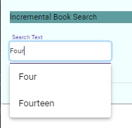
The incremental results in the drop-down list for the filtered options are shown below with a matching incremental prefix search:
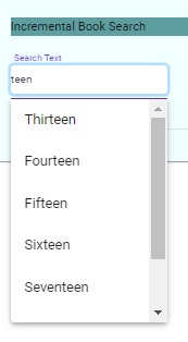
And a matching incremental postfix search:
We can make the above more useful by connecting our data source to backend API data, then allowing the user to filter that within our auto incremental dropdown.
I will show how this is done in the next section.
Connecting our Incremental Search to API Backend Data
Instead of the hard-coded filtered options array, we can connect our filter() function to the books array we have populated by subscribing to our backend API as shown:
import { Component, OnInit } from '@angular/core';
import { FormControl } from '@angular/forms';
import { BehaviorSubject, Observable, Subject, Subscription } from 'rxjs';
import { delay, map, startWith } from 'rxjs/operators';
import { Book } from 'src/app/models/Book';
import { ApiService } from 'src/app/services/api.service';

@Component({
  selector: 'app-book-incremental-search',
  templateUrl: './book-incremental-search.component.html',
  styleUrls: ['./book-incremental-search.component.scss']
})
export class BookIncrementalSearchComponent implements OnInit {

  hasSearchResults$ = new BehaviorSubject<boolean>(false);
  subscription: Subscription;
  filteredOptions: Observable<Book[]>;
  myControl = new FormControl();

  constructor(private api: ApiService) {}

  ngOnInit() {
  	this.subscription = this.api.getBooks()
      .pipe(delay(3000))
      .subscribe((res: Book[]) => {
        this.books = res
      	console.log("read books from API");
      });

   	this.filteredOptions = this.myControl
      .valueChanges.pipe(
        startWith(''),
        map(value => this._filter(value)),
      );
  }

  private _filter(value: string): Book[] {
    const filterValue = value.toLowerCase();
    return this.books.filter(option =>
      option.title.toLowerCase().includes(filterValue));
  }
The above filter is then subscribed to within our HTML template auto complete control as shown to display titles from our Book structure we obtained from the backend:
<mat-autocomplete #auto="matAutocomplete">
  <mat-option
    *ngFor="let option of filteredOptions | async"
    [value]="option.title">
    {{option.title}}
  </mat-option>
</mat-autocomplete>
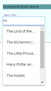
The resulting incremental search looks like this:
An item selected from the drop-down list is the value attribute of the mat-option control which we can display within the editable part of the input control:

As we can see, the use of incremental searches within the Material auto-completion component is a useful method within the user interface to allow users to filter and select options from a large data set instead of scrolling through hundreds of choices within a drop-down list.
The decision to use incremental search is dependent on the quantity of data being retrieved from the backend and how much of that data is filtered from your Angular API service before being handled by your interface components. With smaller data sets, the use of a standard selectable drop-down list is the preferred option.
That is all for today’s post.
I hope you have found this post useful and informative.
Andrew Halil is a blogger, author and software developer with expertise of many areas in the information technology industry including full-stack web and native cloud based development, test driven development and Devops.

