
Welcome to today’s post.
In today’s post I will first explain what content projection is, and why we use content projection.
I will then explain what the different types of content projection patterns are, then show how to use each of the different types of content projection within an Angular component within an application.
In the first section, I will define content projection, explain when to use it when developing components within an Angular application, then explain the types of content projection.
What is Content Projection and when to use it?
Content projection allows us to insert (project) content into another component. The inserted content can then be displayed within the container component.
The types of content that can be inserted within a container component include:
- HTML
- Other components
The main reason we can make use of content projection is to re-use existing components to create other components. This makes our applications more modular, easier to test and ensures code and templates within our Angular application can be re-used.
There are three different types of content projection that we can use:
- Single-slot content projection
- Multi-slot content projection
- Conditional content projection
In addition, there are two different sub-types of conditional content projection: user-driven and data driven.
I will go through each of the above types, explain it, then demonstrate how to implement it with an example.
In the next section, I will explain what single-slot content projection is and how to use it.
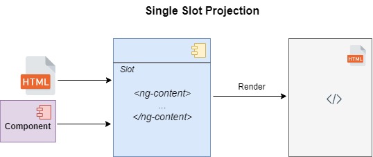
Single-Slot Content Projection
Single slot projection allows us to insert one item of content into a container component. This is the simplest way to project content into another component. The source of the content, as explained earlier can either be HTML or an existing component.
A single-slot projection component consists of a HTML template and component class. The HTML template consists of a <ng-content> tags that will contain the projected content.
This is shown in the HTML template file markup shown below:
demo-content-projection-single.component.html
<h2>Single-slot content projection</h2>
<ng-content></ng-content>
The component class is like any other Angular component and is shown below:
demo-content-projection-single.component.ts
import { Component } from '@angular/core';

@Component({
    selector: 'app-demo-content-projection-single',
    templateUrl: './demo-content-projection-single.component.html',
    styleUrls: ['./demo-content-projection-single.component.scss']
})
export class DemoContentProjectionSingleComponent {
}
The HTML template can also be specified inline within the component class directive as shown:
@Component({
    selector: 'app-demo-content-projection-single',
  template: `
    <h2>Single-slot content projection</h2>
    <ng-content></ng-content>
  `
})
export class DemoContentProjectionSingleComponent {
)
To use the above single slot projection component, we can declare it in HTML markup within a host component as shown:
demo-content-projection.component.html
<h1>Content Projection Demo</h1>

<br />

<app-demo-content-projection-single>
    <p>This is single slot content projection!</p>
</app-demo-content-projection-single>
The component class for the host component is like any other component and is shown below:
import { Component, OnDestroy, OnInit } from '@angular/core';
@Component({
    selector: 'app-demo-content-projection',
    templateUrl: './demo-content-projection.component.html',
    styleUrls: ['./demo-content-projection.component.scss']
})
export class DemoContentProjectionComponent {}
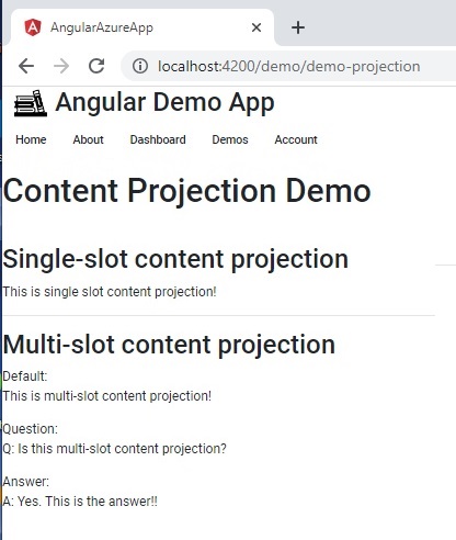
After building and running the application, the host component displays the projected content as shown:
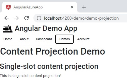
As we can see, the HTML content:
<p>This is single slot content projection!</p>
has been projected into the single-slot component DemoContentProjectionSingleComponent.
The next example I will show is inserting other components other than basic HTML into the content of the projection component.
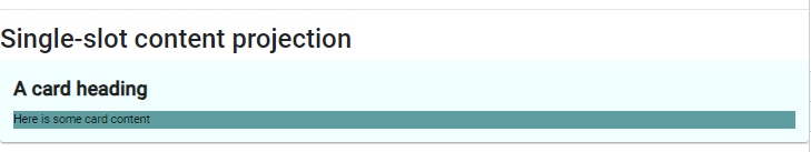
Below is an example of declaring Material Card component definition into a single slot projection:
<app-demo-content-projection-single>
  <mat-card>
    <mat-card-title>
      <div id="heading"><b>A card heading</b></div>
    </mat-card-title>

    <mat-card-content>
      <div id="heading" class="heading">Here is some card content</div>
    </mat-card-content>
  </mat-card>
</app-demo-content-projection-single>
We have applied the same rule as we did for HTML markup and used a Material Card component and tags to declare a card with title and some content. The resulting rendered output is as shown:
In the next section, I will explain what multi-slot content projection is and how to use it.
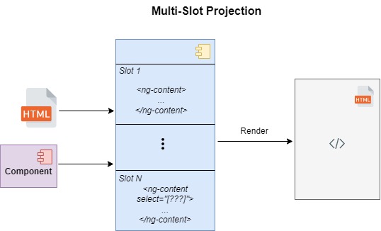
Multi-Slot Content Projection
Multi-slot content projection has more flexibility than single slot projection in that it allows content to be inserted into the host component from multiple sources. Each source that is inserted is distinguished and allotted into its slot by a select attribute which specifies the CSS selector that is matched within the ng-content tag. This is the way this pattern matches content to its slot.
Below is an example of a template for a multi-slot projection component:
demo-content-projection-multislot.component.html
<h2>Multi-slot content projection</h2>

Default:
<ng-content></ng-content>

Question:
<ng-content select="[question]"></ng-content>

Answer:
<ng-content select="[answer]"></ng-content>
The above template includes two slots, each specified and matched by the CSS selectors, [question] and [answer] for the inserted question and answer content.
An example of the rendering of multi-slot projection component within the host component for the above two selectors is shown below:
demo-content-projection.component.html
<app-demo-content-projection-multislot>
  <p>This is multi-slot content projection!</p>
  <p question>Q: Is this multi-slot content projection?</p>
  <p answer>A: Yes. This is the answer!!</p>
</app-demo-content-projection-multislot>
On running the application, the rendered output for the multi-slot projection component is shown below:
Where there is no matching CSS selector in the template, the content is inserted into the default content slot.
In the next section, I will explain what conditional content projection is and how to use it.
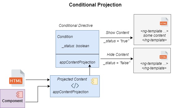
Conditional Content Projection (Overview)
Conditional content projection allows content to be rendered conditionally. In addition, it allows us to render content multiple times.
Unlike the single and multiple content projection patterns, which require the use of the <ng-content> element within the HTML template to match and insert rendered content, the conditional content projection pattern requires the template to include an <ng-template> element to specify content that will be conditionally rendered.
What the <ng-content> element does is to initialize the content within the tags. If the content is enclosed within a conditional ngIf statement, <ng-content> will still initialize the content but will not render it. This creates redundant initialization calls and performance delays during content projection. The <ng-template> element does not have this undesirable side-effect in that it will not initialize projected content that does not satisfy the condition. In addition, <ng-template> will only render content that is initialized (and satisfies the condition).
In the next section, I will explain what user-driven conditional content projection is and how to use it.
Conditional Content Projection (User Driven)
To implement a conditional content projection component that is user (interface) driven, we can create the following in the component class demo-content-projection-conditional.component.ts:
A directive with a CSS selector for the projected content. It will have a constructor that takes a reference to the projected template.
@Directive({
    selector: '[appContentProjection]'
})
export class DemoContentProjectionConditionalDirective {
    constructor(public templateRef: TemplateRef<unknown>) {}
}
The content projection component class. It should contain the following:
a) A @ContentChild() directive which references the conditional directive class.
b) A conditional content HTML template.
c) A condition that determines visibility of the content.
An example is shown below:
@Component({
    selector: 'app-demo-content-projection-conditional',
    templateUrl: './demo-content-projection-conditional.component.html',
    styleUrls: ['./demo-content-projection-conditional.component.scss']
})
export class DemoContentProjectionConditionalComponent implements OnInit {
    contentId: string = ``;
    @Input() show = false;
    @ContentChild(DemoContentProjectionConditionalDirective) content!: DemoContentProjectionConditionalDirective;

    ngOnInit(): void {
        counterId = counterId + 1;
        this.contentId = `conditional-${counterId}`;
    }
}
A Conditional directive with a CSS selector for the triggering interface element. It should contain the following:
a) It will have a constructor that takes a reference to the conditional content projection component class.
b) A @HostListener() directive that defines the condition on the conditional content projected component class.
An example directive is shown below:
@Directive({
    selector: 'button[appContentProjectionToggle]',
  })
  export class DemoContentProjectionConditionalToggleDirective {
    @HostListener('click') toggleConditionalComponent() {
      this.projected.show = !this.projected.show;
    }
    constructor(public projected: DemoContentProjectionConditionalComponent) {}
}
If there were no visual interface (such as a button) involved in controlling the visibility of the content, then we could replace the directive with a component that contains an input that can also set and toggle the show visibility flag of the projected component.
The component’s HTML template consists of the following:
demo-content-projection-conditional.component.html
<h2>Conditional content projection</h2>
<ng-content></ng-content>
<div *ngIf="show" [id]="contentId">
    <ng-container [ngTemplateOutlet]="content.templateRef"></ng-container>
</div>
The above HTML template defines the condition flag, show that determines visibility of the projected content. The input parameter, [ngTemplateOutlet] of the container, contains the content that is projected conditionally into the component.
The above conditional projection component declared with a trigger interface element and a template within a host component is shown below:
<app-demo-content-projection-conditional>
  <button type="button" appContentProjectionToggle>This is conditional content projection!</button>
  <ng-template appContentProjection>
    It changes depending on a condition.
  </ng-template>
</app-demo-content-projection-conditional>
The conditional projection component source is shown below:
demo-content-projection-conditional.component.ts
import { Component, ContentChild, Directive, HostListener, Input, OnInit, TemplateRef } from '@angular/core';
@Directive({
    selector: 'button[appContentProjectionToggle]',
  })
  export class DemoContentProjectionConditionalToggleDirective {
    @HostListener('click') toggleConditionalComponent() {
      this.projected.show = !this.projected.show;
    }
    constructor(public projected: DemoContentProjectionConditionalComponent) {}
}

@Directive({
    selector: '[appContentProjection]'
})
export class DemoContentProjectionConditionalDirective {
    constructor(public templateRef: TemplateRef<unknown>) {}
}

let counterId = 0;

@Component({
    selector: 'app-demo-content-projection-conditional',
    templateUrl: './demo-content-projection-conditional.component.html',
    styleUrls: ['./demo-content-projection-conditional.component.scss']
})
export class DemoContentProjectionConditionalComponent implements OnInit {
    contentId: string = ``;
    @Input() show = false;
    @ContentChild(DemoContentProjectionConditionalDirective) content!: DemoContentProjectionConditionalDirective;

    ngOnInit(): void {
        counterId = counterId + 1;
        this.contentId = `conditional-${counterId}`;
    }
}
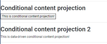
After running the above implementation of the conditional projected content component, we see the following rendered output of the initial state of the conditional projected content component:
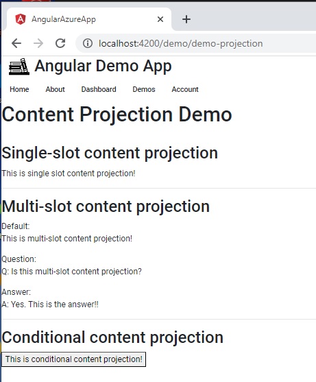
The above shows no content under the trigger button.
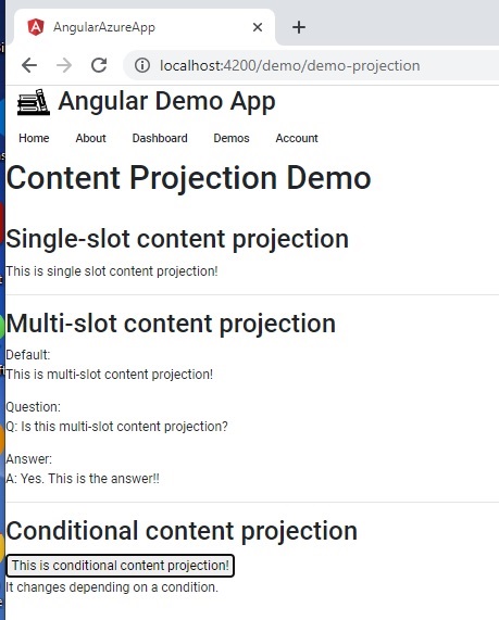
After the button is pressed, the rendered output of the conditional projected content component displays the content within the <ng-template> element as shown:
In the next section, I will explain what data-driven conditional content projection is and how to use it.
Conditional Content Projection (Data Driven)
To implement a conditional content projection component that is data driven, we use a similar method to that for the interface driven content projection. The only difference is this case is the directive that controls the status of the show property in the projected content component.
This is done as shown:
@Directive({
    selector: '[appContentProjectionVisibility]',
  })
  export class DemoContentProjectionConditionalVisibilityDirective2 {
    _status: boolean = false;

    @Input("status")
    set Status(value: boolean)
    {
        this._status = value;
        this.projected.show = value;
    }

    get Status() { return this._status; }

    constructor(public projected: DemoContentProjectionConditionalComponent2) {}
}
The difference above is the use of the @Input() decorator to accept the status input parameter, which then sets the show property of an instance of the projected content component.
The data driven approach for the projected conditional content is shown in the following component class demo-content-projection-conditional-1.component.ts:
import { Component, ContentChild, Directive, Input, OnInit, TemplateRef } from '@angular/core';

@Directive({
    selector: '[appContentProjectionVisibility]',
  })
  export class DemoContentProjectionConditionalVisibilityDirective2 {
    _status: boolean = false;

    @Input("status")
    set Status(value: boolean)
    {
        this._status = value;
        this.projected.show = value;
    }

    get Status() { return this._status; }

    constructor(public projected: DemoContentProjectionConditionalComponent2) {}
}


@Directive({
    selector: '[appContentProjection2]'
})
export class DemoContentProjectionConditionalDirective2 {
    constructor(public templateRef: TemplateRef<unknown>) {}
}

let counterId = 0;

@Component({
    selector: 'app-demo-content-projection-conditional-1',
    templateUrl: './demo-content-projection-conditional-1.component.html',
    styleUrls: ['./demo-content-projection-conditional-1.component.scss']
})
export class DemoContentProjectionConditionalComponent2 implements OnInit {

    contentId: string = ``;

    @Input() show = false;

    @ContentChild(DemoContentProjectionConditionalDirective2) content!: DemoContentProjectionConditionalDirective2;

    ngOnInit(): void {
        counterId = counterId + 1;
        this.contentId = `conditional-${counterId}`;
    }
}
The host component can render the data driven conditional content with the following markup:
<app-demo-content-projection-conditional-1>
  <div appContentProjectionVisibility [status]="false">This is data-driven conditional content projection!</div>
  <ng-template appContentProjection2>
    It changes depending on a data condition.
  </ng-template>
</app-demo-content-projection-conditional-1>
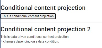
In the above HTML, the DIV element containing the selector appContentProjectionVisibility sets the status property to false. This will change the projected content to hide the content within the conditional template. When the application is run, the rendered output is shown:
To show content conditionally, we can set the input status to true as shown:
<app-demo-content-projection-conditional-1>
  <div appContentProjectionVisibility [status]="false">This is data-driven conditional content projection!</div>
  <ng-template appContentProjection2>
    It changes depending on a data condition.
  </ng-template>
</app-demo-content-projection-conditional-1>
In the above HTML, the DIV element containing the selector appContentProjectionVisibility sets the status property to true. This will change the projected content to show the content within the conditional template. When the application is run, the rendered output is shown:
We have seen how to use the different types of content projection patterns within Angular components.
We have also seen how to make use of content projection to components by applying rendering from single and multiple sources. In addition, we have seen how to add content projection to a component conditionally. I also explained the difference between the <ng-content> and <ng-template> elements and how they are used in content projection. We have also seen how to apply conditional content projection within a component in two different ways: by using a user-driven directive and using a data-driven directive.
That is all for today’s post.
I hope you have found this post useful and informative.
Andrew Halil is a blogger, author and software developer with expertise of many areas in the information technology industry including full-stack web and native cloud based development, test driven development and Devops.