
Welcome to today’s post.
In today’s post I will be showing how to use the Bootstrap Time Picker user interface control within an Angular application.
Before we can use the Bootstrap Time Picker control, you will need to have installed the NG Bootstrap NPM package into your Angular application.
In an earlier post I showed how to install and configure Bootstrap within an Angular application.
After you have installed Bootstrap, there will be many components that will be ready for you to use within your application. To summarize, the NG Bootstrap package when installed will have it’s version in the package.json as shown in the dependencies section:
"dependencies": {
  …
  "@ng-bootstrap/ng-bootstrap": "^5.3.1",
  …
The bootstrap module library is imported into your app module as shown:
import { NgbModule } from '@ng-bootstrap/ng-bootstrap';

…

@NgModule({
  declarations: [
    …
  ],
  imports: [
    NgbModule,
    …
  ],
Defining the Time Picker Control
To use a date picker within a component, use the ngb-timepicker tag to declare a time picker control.
An example of a declaration within a HTML template is shown below:
<mat-card-content>
  <form [formGroup]="meetingForm">
    …
    <div class="form-group">
      <label for="timeStart">Start Time:</label>
      <ngb-timepicker
        [meridian]="meridianStart"
        ngbTooltip="Start Time"
        formControlName="timeStart">
      </ngb-timepicker>
    </div>

    <div *ngIf="timeStart.invalid &&
      (timeStart.dirty || timeStart.touched || submitted)"
      class="alert alert-danger">
      <div *ngIf="timeStart.errors.required">
        Time Start is required.
      </div>
    </div>

    <div class="form-group">
      <label for="timeEnd">End Time:</label>
      <ngb-timepicker
        [meridian]="meridianEnd"
        ngbTooltip="End Time"
        formControlName="timeEnd">
      </ngb-timepicker>
    </div>
    …
  </form>
</mat-card-content>
Below are some of the attributes of common to the Bootstrap theme within the time picker control that we can use:
ngbTooltip="Start Time"
The ngbTooltip attribute specifies the tooltip that is used to provide a hint to the user when the user hovers over the control.
[meridian]="meridianEnd"
The meridian attribute specifies the meridian to start with. This is either AM (before 12pm) and PM (after 12pm).
formControlName="timeStart"
When we use the Reactive forms FormBuilder control, the formControlName attribute is used to specify the corresponding FormControl control within the form control collection. To declare the Reactive forms libraries, we apply the following imports within our typescript code:
import { FormBuilder, Validators } from '@angular/forms';
To make use the above time picker UI declaration, we declare the following variables as follows:
For the meridian flag we declare a Boolean variable for each time picker control that is declared within our HTML:
meridianStart = true;
meridianEnd = true;
To populate each time picker with a default time, we need to specify a JSON structure that contains the following keys:
hour
minute
For the time picker controls we have declared in the UI, the following variable declarations are needed:
timeStart: any = {hour: 9, minute: 0};
timeEnd: any = {hour: 9, minute: 30};
The above initialized variables will set our start time to 09:00 AM and the end time to 09:30 AM.
Binding the Time Pickers to Form Controls
To bind the time pickers within the form builder control collection we apply the defaults as shown within our constructor:
constructor(private api: ApiService, private lookupService: LookupService,
  private router: Router, private fb: FormBuilder) {
    this.initForm(fb);
}

private initForm(fb: FormBuilder) {
  …
  this.meetingForm = fb.group({
    …
    timeStart: [this.timeStart, Validators.required],
    timeEnd: [this.timeEnd, Validators.required]
  });
}
In addition, within ngOnInit(), we can set the time picker to the associated time picker FormControl control with the SetValue() method with an initialised variable that satisfies the JSON structure I showed earlier:
ngOnInit(): void {
  console.log("MeetingNew Component instantiated");

  let currTimeStart: any = {hour: 12, minute: 0};
  let currTimeEnd: any = {hour: 13, minute: 0};

  this.meetingForm.controls['timeStart'].setValue(currTimeStart);
  this.meetingForm.controls['timeEnd'].setValue(currTimeEnd);
  ..
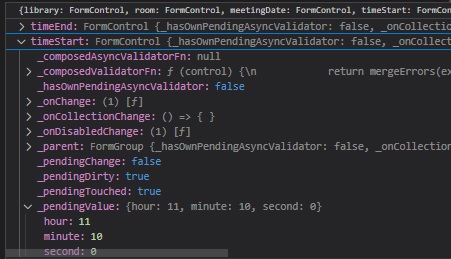
Below is an excerpt of the debugger showing a pending JSON value when setting the value of the time picker:
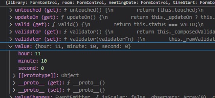
Below is an excerpt of the debugger showing the JSON value when setting the value of the time picker:
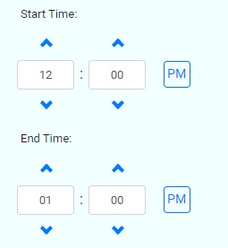
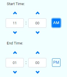
When the time is set to a default hour and minute, the control has two numeric edit controls that are populated as shown with clickable arrow controls above each numeric control and a meridian button control to the right of the minute control as shown:
When the hour edit control value decreases below the 12th hour, the meridian changes back to AM as shown:
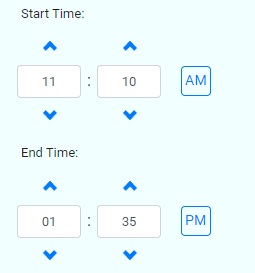
When the Meridian button control is clicked, it will momentarily show as highlighted in dark blue as shown:
Below is a screen shot show of a pair of time picker controls with a date control above them for a meeting Date and Time input:
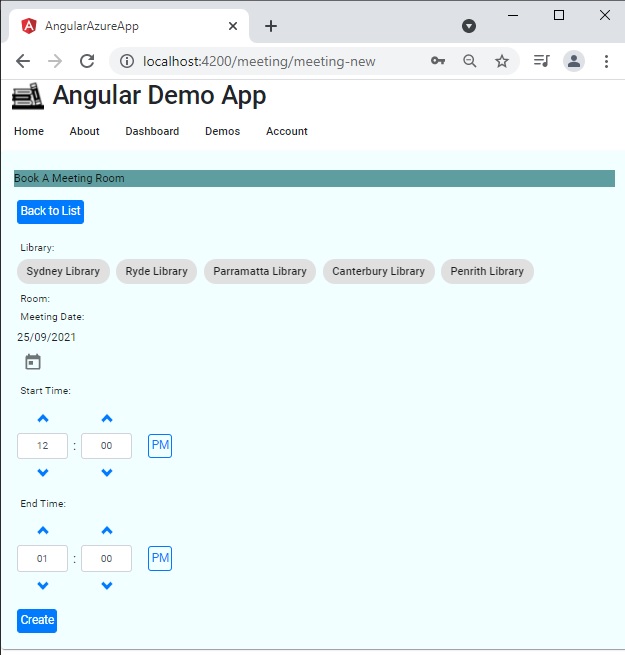
As we can see, the Bootstrap time picker is very useful for data entry and gives our applications a visual enhancement for the end user with spinners and meridian controls ensuring the times entered require minimal validation on the part of the developer. The coding is limited to setting a default time and meridian visibility. When combined with a Material date picker, it makes a very useful combination for our applications.
In addition, the time picker is Bootstrap themed, so we get the additional benefit of mobile responsiveness without any extra development.
In an earlier post I showed how to use Material Time Pickers within an Angular application. You can try experimenting with combining that with the time pickers that I have shown here to see how to combine dates with time ranges.
That is all for today’s post.
I hope you have found this post useful and informative.
Andrew Halil is a blogger, author and software developer with expertise of many areas in the information technology industry including full-stack web and native cloud based development, test driven development and Devops.

