
Welcome to today’s post.
In today’s post I will be explaining what an attribute directive is and how to make use of it within Angular components.
I will briefly define what component element selectors and component attribute selectors are in the context of a component and then explain what attribute directives are. I will finally provide examples on how attribute directives are used within Angular components.
I will start by explaining what component selectors are.
Component Element Selectors
A component element selector is a HTML element tag that is used to declare a component within a HTML template. The component selector below is a component element selector:
@Component({
  selector: 'my-comp,
Which is declared within a HTML template as follows:
<my-comp></my-comp>
When the above component is rendered, it’s HTML template will be projected and evaluated between the above tags.
Now I will explain what an attribute selector is.
Component Attribute Selectors
A component attribute selector is an element attribute that is used to declare an attribute within a HTML element tag. The component selector below is a component attribute selector:
@Component({
  selector: '[my-attr]',
Which is declared within a HTML template within an HTML element as follows:
<p my-attr></p>
We can see that the attribute is used as a property my-attr of the HTML element, which is <p>.
Without the brackets, the component would expect to be parsed as a HTML element instead of as an element attribute.
There is a variation of the attribute selector, which is called an attribute directive.
Attribute Directives
An attribute directive is a custom attribute that can be injected within any HTML element to provide additional custom attributes such as conditional attributes based on template expressions.
In Angular applications, we can use directives to define validations in template forms and for implementing content projection for Angular components. In this case, we will use attribute selectors to allow the directive to manipulate the content of the DOM the element. Later, I will explain the difference between how components and directives modify the DOM within the host component.
An attribute directive selector declaration is as shown:
@Directive({
  selector: '[my-attr]',
Which is declared within a HTML template within an HTML element as follows:
<p my-attr></p>
At this point, you might be confused.
What is the difference between a directive and a component?
The major difference between a directive and a component is that a directive does not have a HTML template, but a component does have a HTML template.
A directive can modify the DOM with specific code within the directive, and a component modifies the DOM within its HTML template. More details on directives can be found on the Angular site.
After the above definitions I will describe two examples to illustrate the above components.
We already know how to create components with HTML element selectors, so I will first show an example of a component with an attribute selector.
Below is an excerpt of a HTML template that uses an existing component app-book-list:
<table>
  <thead>
    <tr>
      <app-book-header></app-book-header>
    </tr>
  </thead>
  <tbody>
    <app-book-list
      *ngFor="let item of bookData; let idx=index"
      [item]="item"
      [i]="idx">
    </app-book-list>
  </tbody>
</table>
And in our component source we use some sample data to test out our component as shown:
bookData: any[] = [
    { id: 1, title: 'The Hobbit', author: 'J. R. R. Tolkien', year: 1937 },
    { id: 2, title: '1984', author: 'G. Orwell', year: 1949 },
    { id: 3, title: 'Of Mice and Men', author: 'J. Steinbeck', year: 1937 }
  ];
}
In the above component we have the following HTML component template for app-book-list:
<tbody>
  <tr>
    <td class="col1">
      <span>{{ i + 1 }}</span>
    </td>
    <td class="col2">
      <span>{{ item.title }}</span>
    </td>
    <td class="col3">
      <span>{{ item.author }}</span>
    </td>
    <td class="col4">
      <span>{{ item.year}}</span>
    </td>
    <td class="col5">
      <button class="btn btn-primary" type="button">View</button>
      <button class="btn btn-primary" type="button">Update</button>
      <button class="btn btn-primary" type="reset" (click)="removeItem(item)">
        Delete
      </button>
    </td>
  </tr>
</tbody>
In the next section, I will show how to include attribute selectors into the component.
Components with Attribute Selectors
To convert the above header and detail components to components with attribute selector, we can re-construct our HTML and use the component as an attribute as shown:
<table class="table ">
  <thead>
    <tr app-book-header></tr>
  </thead>

  <tbody>
    <tr
      app-book-list
      *ngFor="let item of bookData; let idx = index"
      [item]="item"
      [i]="idx">
    </tr>
  </tbody>
</table>
As we can see, our components app-book-header and app-book-list are attributes of the <tr> HTML element.
We can convert the header component to a component with an attribute selector as shown:
Book Header
HTML
<th>Id</th>
<th>Title</th>
<th>Author</th>
<th>Year</th>
<th>Action</th>
TS
import { Component, OnInit } from '@angular/core';

@Component({
  selector: '[app-book-header]',
  templateUrl: './book-header.component.html',
  styleUrls: ['./book-header.component.css'],
})
export class BookHeaderComponent implements OnInit {
  constructor() {}
  ngOnInit() {}
}
Similarly, the Book List component is implemented as shown:
Book List
HTML
<td class="col1">
  <span>{{ i + 1 }}</span>
</td>
<td class="col2">
  <span>{{ item.title }}</span>
</td>
<td class="col3">
  <span>{{ item.author }}</span>
</td>
<td class="col4">
  <span>{{ item.year }}</span>
</td>
<td class="col5">
  <button class="btn btn-primary" type="button">View</button>
  <button class="btn btn-primary" type="button">Update</button>
  <button class="btn btn-primary" type="reset" (click)="removeItem(item)">
    Delete
  </button>
</td>
TS
import { Component, Input, OnInit } from '@angular/core';

@Component({
  selector: '[app-book-list]',
  templateUrl: './book-list.component.html',
  styleUrls: ['./book-list.component.css'],
})
export class BookListComponent implements OnInit {
  @Input() item: any;
  @Input() i: number;

  constructor() {}
  ngOnInit() {}

  removeItem(val: any) {
    console.log('selected item = ' + val['id']);
  }
}
CSS
td.col1 {
  width: 5%;
  border-style: solid;
  border-width: 1px;
}

td.col2 {
  width: 15%;
  border-style: solid;
  border-width: 1px;
}

td.col3 {
  width: 20%;
  border-style: solid;
  border-width: 1px;
}

td.col4 {
  width: 15%;
  border-style: solid;
  border-width: 1px;
}

td.col5 {
  width: 25%;
  border-style: solid;
  border-width: 1px;
}
When we run the above application with the two refactored components, we have the table, header, and row components looking like the following:
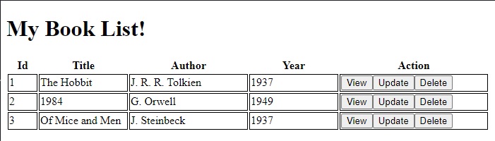
As we can see, the use of the attribute selector has allowed us to turn each table row into a component that is bound to the <tr> table element as an attribute!
Components with Attribute Directives
The next example is an extension of the above, where we can define an attribute directive to allow us to change the background color of the table rows. I will show how this is done.
We can define a colour attribute appRowColor which is declared within each table row <tr> as follows:
<tr
  [appRowColor]="curr_color"
  app-book-list
  *ngFor="let item of bookData; let idx = index"
  [item]="item"
  [i]="idx">
</tr>
In our container component we define a variable to hold the color:
TS
import { Component } from '@angular/core';

@Component({
  selector: 'my-app',
  templateUrl: './app.component.html',
  styleUrls: ['./app.component.css'],
})
export class AppComponent {
  name = 'My Book List';
  curr_color: string = 'green';
  …
}
The row color attribute directive needs an input setter so that we can assign a background color to the component’s DOM element. The setter then calls the private method ColorRowBackground(), which sets a background color to the DOM element, ElementRef.
Row Color Attribute Directive
import { Directive, ElementRef, Input } from '@angular/core';

@Directive({
  selector: '[appRowColor]',
})
export class RowColorDirective {
  _rowColor: string;
  get appRowColor(): string {
    return this._rowColor;
  }
  @Input() set appRowColor(value: string) {
    this._rowColor = value;
    this.colorRowBackground(value);
  }

  constructor(private el: ElementRef) {}

  private colorRowBackground(color: string) {
    this.el.nativeElement.style.backgroundColor = color;
 }
}
Declaring Directives is done using the declarations array within the app module as shown:
App Module
import { NgModule } from '@angular/core';
import { BrowserModule } from '@angular/platform-browser';
import { FormsModule } from '@angular/forms';

import { AppComponent } from './app.component';
import { BookHeaderComponent } from './book-header/book-header.component';
import { BookListComponent } from './book-list/book-list.component';
import { RowColorDirective } from './row-color.directive';

@NgModule({
  imports: [BrowserModule, FormsModule],
  declarations: [
    AppComponent,
    BookHeaderComponent,
    BookListComponent,
    RowColorDirective,
  ],
  bootstrap: [AppComponent],
})
export class AppModule {}
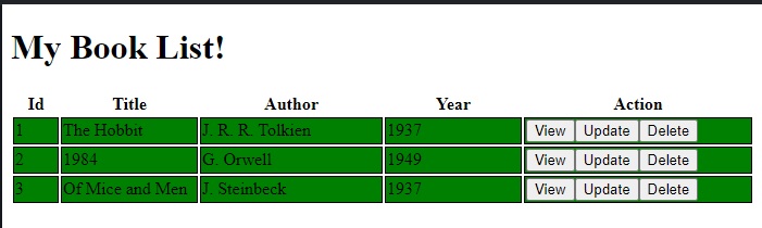
After the above application is run with the directive included within the book list component, we will see rows with a green background as shown:
We can see how useful both attribute selectors and attribute directives can be used within components to customize the structure of HTML elements and the behavior and style of components within HTML elements.
As we saw in my previous post, we used validation attribute directives to provide custom validation for <input> elements. In this post we saw how to use attribute directives to control the look and feel of components.
That is all for today’s post.
I hope you have found this post useful and informative.
Andrew Halil is a blogger, author and software developer with expertise of many areas in the information technology industry including full-stack web and native cloud based development, test driven development and Devops.