
Welcome to today’s post.
In today’s post I will be discussing how to use a common user interface component that is used in web applications. The type of component I will be using is suitable for a data field that measures the level of rating of an item. There are numerous components that can be used to provide a measurement or opinion, these components can include:
- Drop down lists
- Radio buttons
- Sliders
- Chips
Situations where we would make use of a rating component would be:
- Providing an opinion on a product
- Assessing the level of a service
- Reporting the quality of a product or service to end users
I will show how to setup and use a rating component within an Angular application. The user interface library I will use the well-known Bootstrap library.
Setup of the Bootstrap Library
The NG Bootstrap library contains many useful interface components, including the rating component.
In a previous post I showed how to install and setup the Bootstrap theme within an Angular application. will skip the formalities of installing the Bootstrap theme within Angular.
To configure Bootstrap within Angular, we update our application module, app.module.ts to import the Bootstrap library as shown:
import { NgbModule } from '@ng-bootstrap/ng-bootstrap';

@NgModule({
  declarations: [
    …
  ],
  imports: [
    NgbModule,
    …
  ],
  providers: [
    …
  ],
  bootstrap: [AppComponent]
})
export class AppModule { }
In the next section, I explain the Star Rating component, its definition, and its properties.
The Star Rating Component
Before I get around to showing you how to use the Star Rating component within an Angular component, I will explain how to define the component and give a brief overview of the properties of the component.
To declare the Star Component within an Angular component’s template, use the following HTML tag:
<ngb-rating>
…
</ngb-rating>
In between the tags the component attributes correspond to the properties of our Star Component.
Below are the properties and the definitions:
| Property | Definition |
| rate | Current rating value up to the maximum possible rating. An integer value. |
| max | Maximum possible rating. An integer value. |
| ngbToolTip | Tooltip text for the rating component. |
| formControlName | Form control name from the form group corresponding to the rating component. |
The rating property is retrieved and set from a variable declared within the form component.
Given the above properties, the HTML markup for the Star Component will be as shown:
<ngb-rating [(rate)]="currentRating"
        [max]="5"
        ngbTooltip="Rating"
        formControlName="rating">
</ngb-rating>
In the next section, I will show how to integrate the above component into an Angular component.
Adding the Star Rating to an Angular Form Component
Our existing form may be using a reactive template to store the data entry fields as shown:
private initForm(fb: FormBuilder) {
    this.reviewForm = fb.group({
        reviewer: [this.authService.currLoggedInUserValue, Validators.required],
        heading: ['', Validators.required],
        comment: ['', Validators.required],
        rating: [2, Validators.required]
    });
}
In the example, we set the rating with a default of 2 and make it a required field.
Our existing interface uses a basic text edit for accepting the rating from a user. It might even have a tool tip with a binding to the rating field:
<div class="form-group">
<label for="rating">Rating:</label>
    <br />
      <input name="rating"
      		class="form-control col-sm-4"
 		placeholder="Rating"
            	placement="right"
 		ngbTooltip="Rating"
 		formControlName="rating">
</div>
To implement the basic rating within our form, we use the following HTML which uses the default styling that comes with the Bootstrap theme:
<div class="form-group">
<label for="rating">Rating:</label>
    <br />
    <ngb-rating [(rate)]="currentRating"
                [max]="5"
                ngbTooltip="Rating"
                formControlName="rating">
    </ngb-rating>
</div>
When we refresh the form, the resulting rating looks as follows:
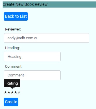
The rating control allows us to interactively click on the control elements, the stars to fill or un-fill the selection. Five un-filled stars is equivalent to no rating (zero) and five filled stars is equivalent to a maximum rating (five).
The default style looks okay, but a little bit bland. We can apply an improved style to the rendered star control by using an ng-template:
<div class="form-group">
<label for="rating">Rating:</label>
<br />
<ngb-rating [(rate)]="currentRating"
[max]="5"
ngbTooltip="Rating"
formControlName="rating">
<ng-template let-fill="fill" let-index="index">
<span class="star"
[class.awesome]="fill === 100"
[class.average]="index === 2"
[class.bad]="index < 2">
★
</span>
</ng-template>
</ngb-rating>
</div>
The span element conditionally styles the star Unicode character (9733 in decimal) depending on the value of the selected star. The CSS styles for the colors are below:
.star {
    font-size: 1.5rem;
    color: #b0c4de;
}
.awesome {
    color: #1e90ff;
}
.average {
    color: yellowgreen;
}
.bad {
    color: #ff1e1e;
}
We could use an alternative symbol apart form a star symbol we could even use a thumbs up. A complete list of HTML Unicode of alternative symbol codes can be obtained from the following link to HTML codes and here for HTML emojis.
When the application refreshes, the form renders the rating control as shown:
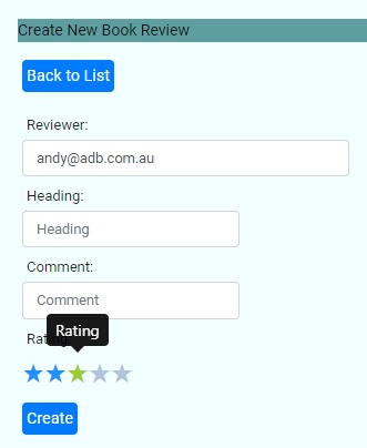
As we can see, the size of the font is bigger, and a colour gradient is used depending on the value of the rating selected.
When the user selects a rating value, the value of the rating is bound to the rating field within the reactive form field controls. Retrieving the value is done by simply using a getter to retrieve the rating from the rating form control:
get rating() {
    return this.reviewForm.get('rating');
}
If we decide to save the record with the selected rating, then the following excerpt shows how we package the rating along with the other fields into a posted request to save the record through a service:
eventCreateRecord(event)
{
    this.submitted = true;

    if (!this.reviewForm.valid)
        return;

    this.review = {
        bookID: parseInt(this.id),
        rating: parseInt(this.rating.value),
        heading: this.reviewheading.value,
        comment: this.comment.value,
        reviewer: this.reviewer.value
    };

    this.api.saveReview(this.review).subscribe(
        () => {
          …
        }
    );
}
The above demonstrates how to display a rating component using the NG Bootstrap library and usefully extract the selected value and save it into our data store.
By making use of the rating control from the Bootstrap library, we have enhanced the usability of our interface with minimal coding and provided an improved look and feel by utilizing a custom template within the HTML template to conditionally render the style of the rating control.
That is all for today’s post.
I hope you have found this post useful and informative.
Andrew Halil is a blogger, author and software developer with expertise of many areas in the information technology industry including full-stack web and native cloud based development, test driven development and Devops.

